Planner
A React component for dynamic appointment management with drag-and-drop, date selection, and shadcn/ui integration. Enhances apps with efficient scheduling and resource handling.
Dynamic React Planner for Advanced Appointment Scheduling
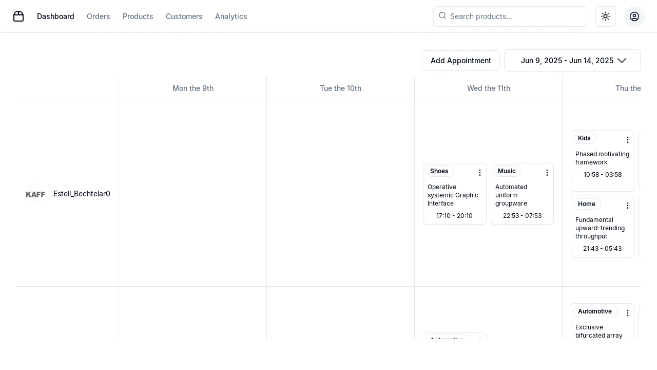
Planner is a versatile React scheduling component designed for developers seeking to integrate sophisticated appointment and resource management into their applications. It offers an intuitive interface, powered by shadcn/ui for adaptability and Atlassian's Pragmatic drag-and-drop for seamless interaction. This tool simplifies complex scheduling tasks, providing daily, weekly, monthly, and yearly views, making it ideal for enhancing applications with efficient, user-friendly scheduling capabilities.
Features:
- Dynamic Scheduling: Manage and visualize appointments effectively across various timelines including daily, weekly, monthly, and yearly views.
- Resource Management: Easily assign and track essential resources such as rooms or personnel associated with specific appointments.
- Drag and Drop Interface: Simplify appointment adjustments and resource allocations with an intuitive drag-and-drop interface, powered by Atlassian's Pragmatic drag and drop.
- Customizable UI (shadcn/ui): Utilize the flexible shadcn/ui components to ensure that Planner fits perfectly within your application's design.
- Date Range Selections: Supports selection and visualization of schedules across custom date ranges.
- react-day-picker Integration: Leverages
react-day-pickerfor robust date picking functionalities. - date-fns for Date Operations: Employs
date-fnsfor efficient handling of date logic and operations. - Appointment CRUD Service: Includes a service (
AppointmentService.ts) for managing appointment data (Create, Read, Update, Delete). - Resource CRUD Service: Provides a service (
ResourceService.ts) for managing resource data. - Context API for State Management: Utilizes React Context (
CalendarDataContext.tsx,PlannerContext.tsx) for managing planner data and overall application state. - Modular Component Architecture: Features a modular structure with UI components following the
shadcn/uiphilosophy for reusability and planner-specific components. - Customizable Scrollbar Styles: Includes CSS for custom scrollbars in calendar components for improved visual integration and user experience.
Summary:
Planner equips developers with a comprehensive React component for building advanced scheduling and resource management functionalities. It combines dynamic appointment visualization across multiple views, intuitive drag-and-drop capabilities, and a customizable UI drawing from shadcn/ui principles. This makes it an excellent choice for applications requiring efficient and user-friendly management of appointments, resources, and timelines, with a strong emphasis on modularity and straightforward integration into existing React projects.

Similar to Planner:
 SERP BLOCKS
