
Prism UI
A React component library augmenting shadcn/ui, offering extra components, pre-made sections, and utilities to accelerate modern web application development.
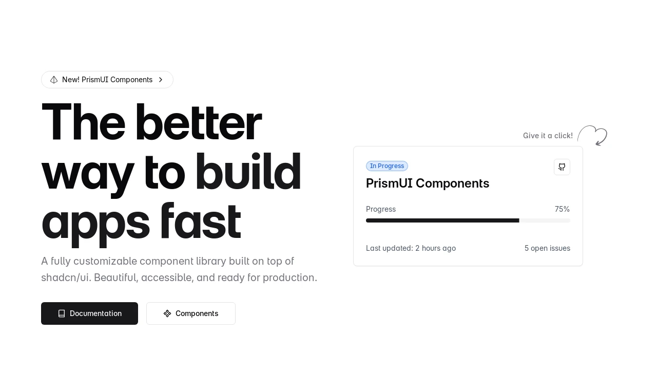
Prism UI: Extend shadcn/ui with Advanced React Components
Prism UI serves as a powerful extension for the shadcn/ui library, equipping React developers with an enriched toolkit. It features supplementary components, ready-to-use page segments like Hero sections and Feature Grids, alongside intricate UI constructs. Grounded in Radix UI and Tailwind CSS, Prism UI focuses on expediting the creation of contemporary, accessible, and visually compelling web interfaces, complete with TypeScript integration and broad customization capabilities for unique branding.
Features:
- Pre-built Hero Sections: Offers multiple layouts for impactful landing page introductions.
- Pre-built Feature Grids: Designed to elegantly showcase product capabilities.
- Pre-built Headers & Navigation: Provides responsive navigation structures for diverse application needs.
- Pre-built Footers: Includes various footer designs to complete website layouts.
- Complex UI Patterns: Delivers sophisticated pre-designed layouts and interface solutions.
- Extended shadcn/ui Functionality: Augments the core shadcn/ui library with new components and features.
- Comprehensive TypeScript Integration: Ensures type safety and improves the developer workflow.
- Accessible Radix UI Primitives: Utilizes Radix UI for a foundation of accessible components.
- Flexible Tailwind CSS Styling: Employs utility-first CSS for deep and adaptable customization.
- Integrated Dark Mode: Includes built-in support for a dark color scheme.
- Adaptive Responsive Design: Ensures components adjust seamlessly across different screen sizes.
- Animated Display Cards: Features dynamic, skewed cards with hover effects for highlighting content.
- Interactive Expandable Cards: Offers card components that expand to show additional information.
- Contextual Floating Action Panel: Provides a floating panel triggered by elements for quick actions.
- Smooth Logo Carousel: Implements an animated carousel for displaying brand or partner logos.
Summary:
Prism UI accelerates web development by enriching the shadcn/ui library with more React components, pre-built page elements, and advanced UI designs. It leverages technologies like Next.js, Radix UI, and Tailwind CSS to help developers construct modern, accessible, and aesthetically pleasing web applications more efficiently. With TypeScript support and customization options, it streamlines the creation of high-quality user interfaces.

Similar to Prism UI:
 SERP BLOCKS