Shadcn Country Dropdown
Next.js project providing ISO-compliant country dropdown and phone input components, built with shadcn/ui for seamless UI/UX integration.
Advanced ISO Country Selection and Phone Input Components for Shadcn/UI & Next.js
Enhance your Next.js applications with these meticulously developed ISO 3166 compliant country dropdown and phone input components. Built upon the robust shadcn/ui framework, they offer a streamlined method for integrating international data entry. These components prioritize ease of use for developers and a clear, intuitive experience for end-users, leveraging libraries like react-circle-flags and country-data-list for rich functionality and visual appeal, simplifying forms requiring global user information.
Features:
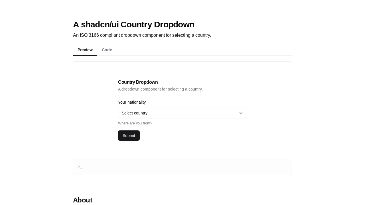
- ISO 3166 Compliant Selection: Offers a dropdown for selecting countries based on ISO 3166 standards.
- Shadcn/UI Integration: Built with shadcn/ui's Popover and Command components for a consistent look and feel.
- Visual Country Flags: Displays country flags using the
react-circle-flagslibrary. - Comprehensive Country Data: Utilizes
country-data-listfor country information, including ISO alpha2/alpha3 codes and names. - Customizable Country Options: Allows developers to provide a filtered or custom list of countries.
- Selection Change Callback (
onChange): Notifies parent components when a country is selected, providing the country object. - Default Value Support: Enables pre-selection of a country using its
alpha3code. - Disabled State Control: Supports a
disabledprop to make the dropdown non-interactive. - Custom Placeholder Text: Allows modification of the default text shown when no country is selected.
- Slim Mode UI: Features a compact 'slim' version that displays only the country flag, ideal for condensed UIs.
- In-Dropdown Search: Includes a search input for quickly filtering and finding countries within the list.
- Clear Visual Feedback: Shows the selected country's flag and name, with a checkmark indicating the current selection in the list.
- Form-Friendly Design: Facilitates easy integration into forms, particularly those built with shadcn/ui.
- Client Component for Next.js: Explicitly uses
"use client"for compatibility with the Next.js App Router. - Responsive Dropdown List: The command list has
max-heightfor better usability on various screen sizes.
Summary:
This project offers a developer-friendly, ISO-compliant Country Dropdown component for Next.js applications, styled with shadcn/ui. It simplifies adding international country selection to forms, featuring flag displays, search, default values, and a space-saving slim mode. The component is designed for ease of integration and aims to provide a polished user experience for capturing standardized country data, alongside a planned phone input component for complete international data handling.

Similar to Shadcn Country Dropdown:
 SERP BLOCKS
