Shadcn Timeline
A free, customizable timeline component for React, built on shadcn/ui and Tailwind CSS. Integrates easily into your projects, offering full code ownership.
Shadcn Timeline: Customizable React Timeline Component
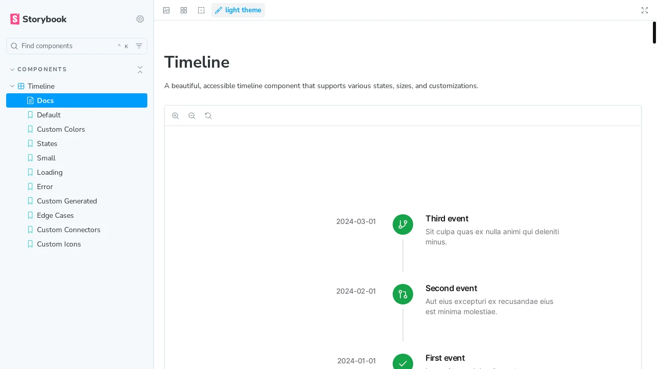
Shadcn Timeline is a beautifully designed, accessible, and highly customizable timeline component developed for React and Tailwind CSS applications. Leveraging the principles of shadcn/ui, it offers developers a ready-to-use solution that can be easily integrated by simply copying and pasting the code into their projects. It's free for both personal and commercial use, allowing you to own and modify the code to perfectly fit your application's requirements and aesthetic.
Features:
- Customizable Appearance: Offers different sizes and colors for the timeline and icons, allowing visual tailoring to your project's theme.
- Full Accessibility: Implements ARIA attributes to ensure the component is usable by people with disabilities.
- Loading and Error States: Provides built-in visual indicators for loading processes and error occurrences within timeline items.
- Smooth Animations: Incorporates Framer Motion for fluid and engaging animations, enhancing user experience.
- Responsive Design: Adapts seamlessly to various screen sizes, ensuring a consistent look and feel on desktop and mobile devices.
- TypeScript Support: Developed with TypeScript, offering type safety and improved developer experience through autocompletion and error checking.
- SSR Compatibility: Fully compatible with Server-Side Rendering, ensuring proper hydration and performance for universal applications.
- Storybook Documentation: Includes comprehensive Storybook documentation with interactive examples for easy learning and integration.
- Icon Customization: Allows developers to use custom ReactNode icons and select predefined color themes for icons in timeline items.
- Status Indicators: Supports visual statuses like 'completed', 'in-progress', and 'pending' for timeline items, providing clear progress updates.
- Flexible Date Formatting: The TimelineTime component offers options to customize date display using string formats or Intl.DateTimeFormatOptions.
- Copy-Paste Integration: Designed for straightforward integration by allowing developers to copy and paste the component code directly into their projects.
Summary:
This Shadcn Timeline component provides developers with a robust and elegant solution for displaying chronological events or processes within their React applications. Built on shadcn/ui and Tailwind CSS, it emphasizes customization, accessibility, and ease of use. Features like responsive design, smooth animations with Framer Motion, and comprehensive Storybook documentation make it a valuable asset for creating engaging user interfaces that require a timeline display, allowing developers to quickly implement and tailor it to their specific project needs.

Similar to Shadcn Timeline:
 SERP BLOCKS
