
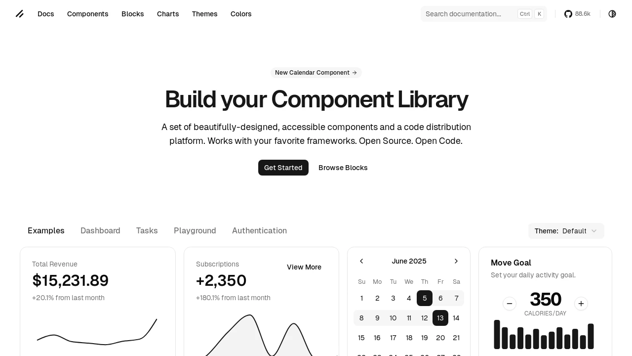
Shadcn UI React
A React component library providing up-to-date Shadcn/UI elements, installable individually and themeable with Tailwind CSS.
Integrate Shadcn/UI Components Seamlessly into React Projects
This library, @teovilla/shadcn-ui-react, offers a curated collection of up-to-date Shadcn/UI components specifically tailored for React development. It simplifies the process of incorporating these beautifully designed and accessible elements into your applications. Each component is individually packaged for granular control over your project's dependencies. The library leverages Tailwind CSS for styling, providing a robust theming system that supports both light and dark modes, ensuring visual consistency and adaptability for your user interfaces.
Features:
- Individual Component Installation: Install only the specific Shadcn/UI components you need for your React project via npm, such as
@teovilla/shadcn-ui-react-button. - CSS Variable Theming: Customize your application's appearance extensively using a
globals.csssetup with CSS variables for colors, spacing, border radius, and more, including built-in light and dark themes. - Flexible Style Integration: Choose to import component-specific CSS via global CSS
@importstatements or directly within your JavaScript/TypeScript files for modularity. - Selectable Visual Styles: Switch between different pre-defined component aesthetics, like 'New York' or 'Default', by adjusting the import path for components.
- Tailwind CSS Foundation: Leverages Tailwind CSS for styling, enabling utility-first approaches and deep customization capabilities.
- Dedicated React Implementation: Provides Shadcn/UI's components specifically adapted and packaged for seamless use within React applications.
Summary:
@teovilla/shadcn-ui-react provides developers with a straightforward method to use popular Shadcn/UI components in their React projects. It features individual component installation, a comprehensive Tailwind CSS-based theming system with dark mode support, and flexible options for style integration. This allows for the creation of modern, customizable, and accessible user interfaces by leveraging a set of well-crafted UI elements, with the ability to switch between different visual styles like 'New York' or 'Default'.

Similar to Shadcn UI React:
 SERP BLOCKS
