
Fully Responsive Sidebar
A responsive sidebar component for Next.js, built with TypeScript, Tailwind CSS, ShadCN, and Lucide Icons, offering easy customization and smooth animations.
Responsive Next.js Sidebar with Tailwind & ShadCN
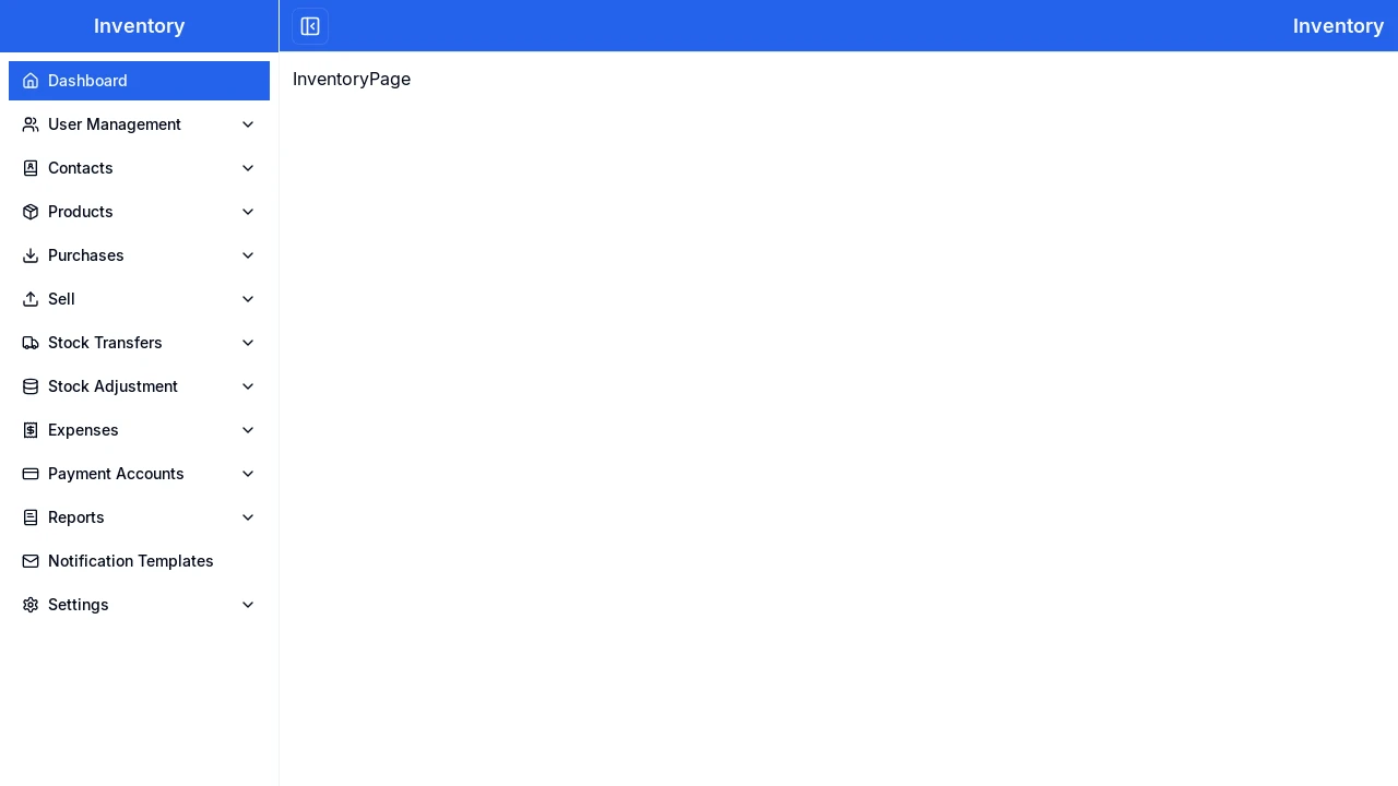
This project offers a highly customizable, fully responsive sidebar component meticulously crafted using Next.js, TypeScript, Tailwind CSS, ShadCN UI, and Lucide Icons. It's engineered for seamless adaptation across various devices, ensuring a consistent and enhanced user experience from desktop to mobile. The sidebar features smooth animations and a toggle button, particularly useful for smaller screens, making it an excellent choice for modern web applications requiring intuitive navigation.
Features:
- Responsive Design: Adapts fluidly to various screen dimensions using Tailwind CSS, ensuring a uniform user experience on all devices.
- Next.js & TypeScript Foundation: Leverages Next.js and TypeScript for type safety and contemporary web development approaches.
- ShadCN UI Integration: Employs ShadCN components to achieve a polished and modern visual style.
- Lucide Icon Set: Integrates Lucide Icons, offering a comprehensive suite of crisp and lightweight visual symbols.
- Collapsible Toggle: Features an integrated toggle button to show or hide the sidebar, improving usability on compact displays.
- Fluid Animations: Incorporates seamless transition effects to elevate the overall user interaction experience.
- Broad Browser Support: Ensures consistent performance and appearance across all leading web browsers.
- Color Scheme Customization: Modify visual appearance by updating Tailwind CSS utility classes or global styles for colors.
- Sidebar Width Adjustment: Easily alter the sidebar's width by changing relevant Tailwind CSS classes.
- Icon Flexibility: Substitute or tailor icons using the Lucide Icons library by importing preferred icons.
- Menu Item Configuration: Add, remove, or reorder navigation items by editing the JSX in Next.js components.
- Responsive Breakpoint Control: Fine-tune mobile responsiveness by customizing Tailwind CSS breakpoints and media queries.
Summary:
This developer resource provides a ready-to-use, fully responsive sidebar template built with a modern tech stack including Next.js, TypeScript, Tailwind CSS, and ShadCN. It's designed for easy integration and customization, enabling developers to quickly implement an adaptive, animated, and user-friendly navigation experience in their web projects. The inclusion of a toggle button and detailed customization options makes it versatile for various application needs.

Similar to Fully Responsive Sidebar:
 SERP BLOCKS
