
Shadcn Blocks
A collection of pre-built, modern UI blocks for shadcn/ui. Easily copy and paste dashboards, authentication pages, and more into your React applications.
shadcn/ui Blocks: Accelerate Web Development with Pre-built Components
shadcn/ui Blocks offers a curated collection of larger, ready-to-use components built upon the popular shadcn/ui library. Developers can significantly speed up their workflow by integrating these pre-designed elements like dashboards, authentication forms, and various layout sections directly into their React projects. These blocks are designed to be clean, modern, and easily customizable, promoting rapid development and consistent UI design across applications. They work seamlessly with React frameworks and are open source.
Features:
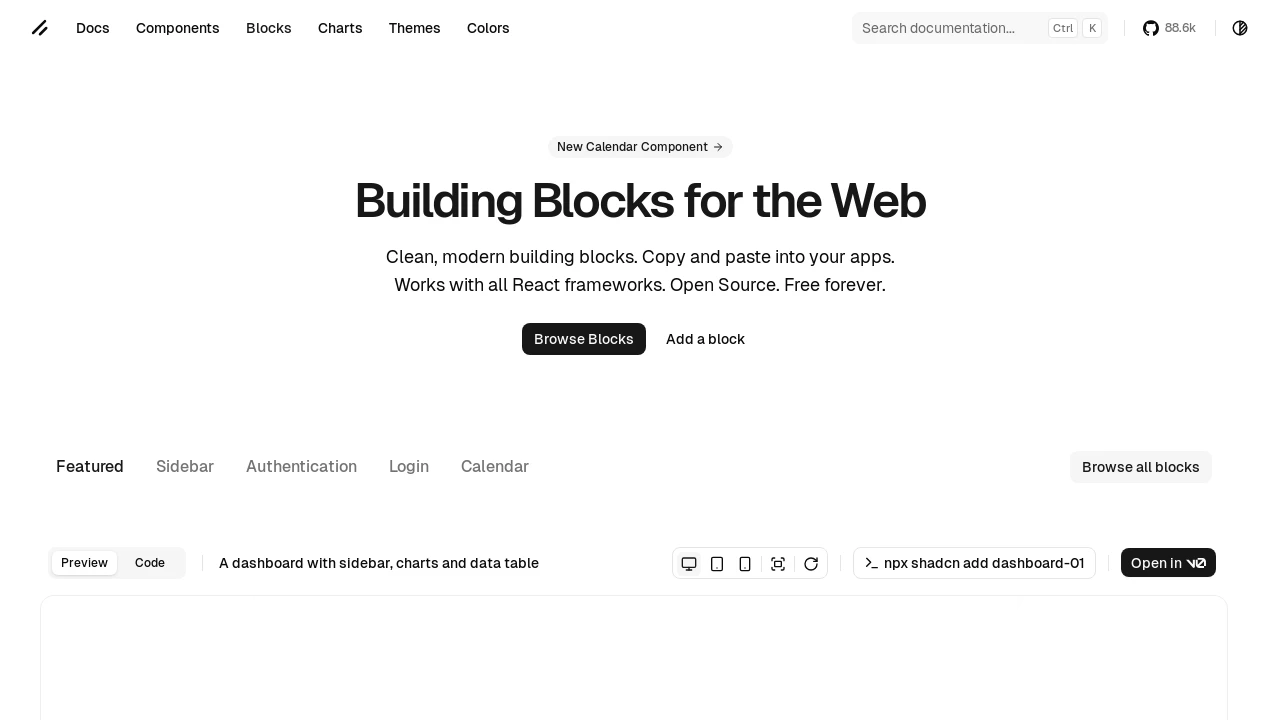
- Dashboard Layouts: Pre-built dashboard structures including elements like sidebars, interactive charts (e.g.,
ChartAreaInteractive), data tables (DataTable), and section cards (example:dashboard-01). - Authentication Pages: Ready-to-use login page templates with variations such as muted backgrounds or image sections (examples:
login-03,login-04). - Sidebar Components: Multiple sidebar implementations including collapsible versions that reduce to icons (e.g.,
sidebar-07) and sidebars with submenus (e.g.,sidebar-03). - CLI Integration: Easily add blocks to your project using the
npx shadcn addcommand. - Modular Block Structure: Each block comes with its own page structure (e.g.,
app/dashboard/page.tsx), component files (e.g.,components/app-sidebar.tsx), and often data files (e.g.,data.json). - React Framework Compatibility: Designed to work across various React frameworks.
- Open Source Access: Freely available for use and modification.
- Copy & Paste Functionality: Enables quick integration of complete UI sections into applications.
- Pre-built UI Sections: Includes ready-made elements like site headers (
SiteHeader) and card-based layouts (SectionCards). - Code Previews: Demonstrates block usage with code snippets for easy understanding and implementation.
- File Structure Overview: Shows the files included in each block for better project organization.
Summary:
shadcn/ui Blocks provides developers with a suite of well-crafted, larger UI components that extend the shadcn/ui ecosystem. These blocks, such as dashboards and login pages, can be quickly integrated into React applications using a simple CLI command. This resource aims to streamline the development process by offering ready-made, customizable solutions for common application sections, allowing developers to focus on core functionality rather than building complex UI elements from scratch.
Tags:

Similar to Shadcn Blocks:
 SERP BLOCKS
