
Shadcn UI
shadcn/ui offers accessible, customizable React components. Copy-paste to build your unique component library using Radix UI and Tailwind CSS.
Develop Custom UI Libraries with shadcn/ui React Components
shadcn/ui presents a curated collection of React components, emphasizing developer control and deep customization. It leverages Radix UI for robust accessibility and Tailwind CSS for flexible styling. The distinctive copy-paste methodology allows developers to integrate components directly into their projects. This approach empowers the creation of bespoke component libraries, free from traditional dependency constraints, offering full ownership over the codebase and visual design for any application.
Features:
- Copy-Paste Integration: Enables direct embedding of component code into your project, offering unparalleled control and eliminating external dependencies.
- Accessibility-Focused: Components are built upon Radix UI primitives, ensuring they adhere to high accessibility standards out-of-the-box.
- Tailwind CSS Styling: Utilizes Tailwind CSS for utility-first styling, allowing for rapid and extensive visual customization.
- Build Your Own Library: Designed to help developers construct their own, perfectly tailored component libraries rather than importing a pre-styled one.
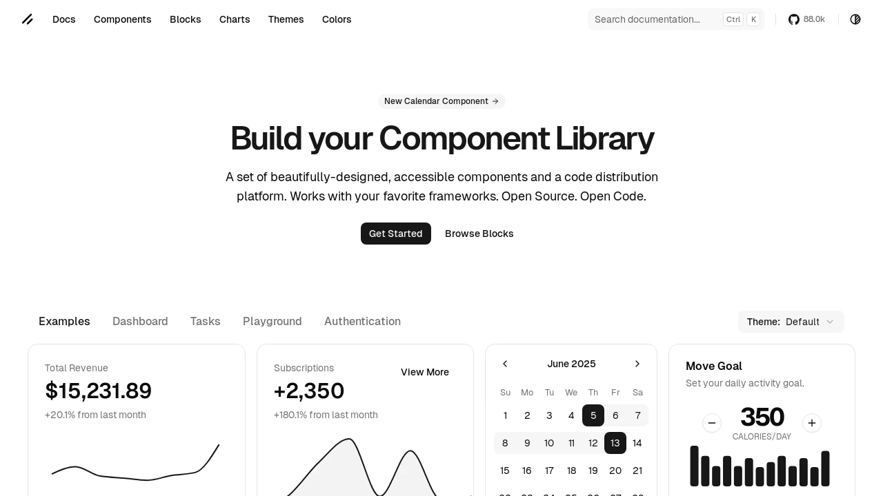
- Comprehensive Component Set: Includes a wide array of UI elements such as navigation menus, search inputs, calendars, data tables, and various form controls.
- Theming Capabilities: Supports theme customization, including built-in light and dark modes, and options for creating custom color schemes.
- Pre-built Blocks & Examples: Offers ready-to-use UI blocks and example implementations like dashboards, authentication flows, and task managers to speed up development.
- React-Centric: Primarily designed and optimized for React applications, providing a rich set of tools for modern web UIs.
- Open Source & Free: Licensed under MIT, allowing free usage and modification, with community-driven improvements.
- Component Registry & Documentation: Features a comprehensive documentation site and a component registry for easy browsing and implementation guidance.
- Interactive Elements: Provides rich interactive components like modals (e.g., for cookie settings, account creation, issue reporting), data tables with sorting and pagination, and complex form structures.
- Chart Integration: Includes capabilities for displaying data visually through chart components.
Summary:
shadcn/ui revolutionizes UI development for React projects by providing a suite of beautifully designed, accessible, and customizable components. Developers can directly copy and paste these Radix UI and Tailwind CSS-based components into their applications. This grants complete control, removes dependency overhead, and facilitates the rapid creation of unique, project-specific component libraries, enhancing flexibility and development speed for modern web interfaces.
Tags:

Similar to Shadcn UI:
 SERP BLOCKS
