
shadcn-font-picker
A React font picker component leveraging Shadcn UI and the Google Fonts API, offering dynamic font selection and preview for web projects.
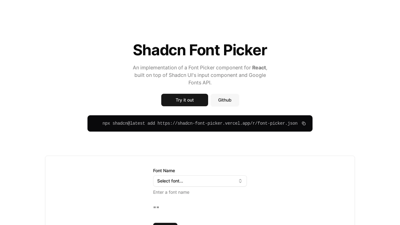
Dynamic Google Font Picker for React with Shadcn UI
This React component provides a seamless way to integrate Google Fonts into your projects. Built upon Shadcn UI components like Input, Command, DropdownMenu, and Popover, it fetches fonts directly from the Google Fonts API. Developers can easily implement a user-friendly font selection interface, complete with search, filtering by category, and live font previews, enhancing the text customization capabilities of their applications.
Features:
- Google Fonts Integration: Fetches and utilizes fonts directly from the Google Fonts API.
- Dynamic Font Loading & Preview: Loads fonts on demand and provides an immediate visual preview of the selected font style.
- Search Functionality: Enables users to easily search for fonts by their family name within the picker.
- Category Filtering: Allows filtering fonts by standard categories (e.g., serif, sans-serif, display) and includes an "All Categories" option.
- Shadcn UI Components Utilized: Built using core Shadcn UI elements including Button, Command, DropdownMenu, and Popover for a consistent and modern UI.
- Efficient List Rendering: Implements
react-window(FixedSizeList) for optimized performance and smooth scrolling with extensive font lists. - Customizable Dimensions: Offers props to set custom
widthandheightfor the font picker popover, adapting to various layouts. - Filter Visibility Control: Provides an option (
showFilters) to toggle the display of the font category filters. - Selected Font Indication: Clearly displays the currently selected font in the trigger button and visually highlights it within the selection list.
- Loading and Error States: Includes visual indicators for loading fonts and handles potential errors during the fetching process gracefully.
onChangeCallback: Exposes a callback function that is triggered when a new font is selected, returning the chosen font family.- Controlled Component Behavior: Supports a
valueprop to programmatically set or pre-select a font, allowing for integration with form state. - Responsive Trigger Button: The main trigger button text dynamically updates to show the currently selected font or a default placeholder.
Summary:
The Shadcn Font Picker is a specialized React component designed for seamlessly incorporating Google Fonts into web applications. It leverages Shadcn UI's robust components and the Google Fonts API to offer a rich user experience featuring dynamic font searching, category-based filtering, and instant visual previews. This tool significantly simplifies typography management for developers, enabling easy selection and application of a diverse range of fonts within their projects, enhancing design flexibility.

Similar to shadcn-font-picker:
 SERP BLOCKS
