shadcn-country-dropdown
A React component for shadcn/ui, offering an ISO 3166 compliant country selector with flags, search, and customization options for developers.
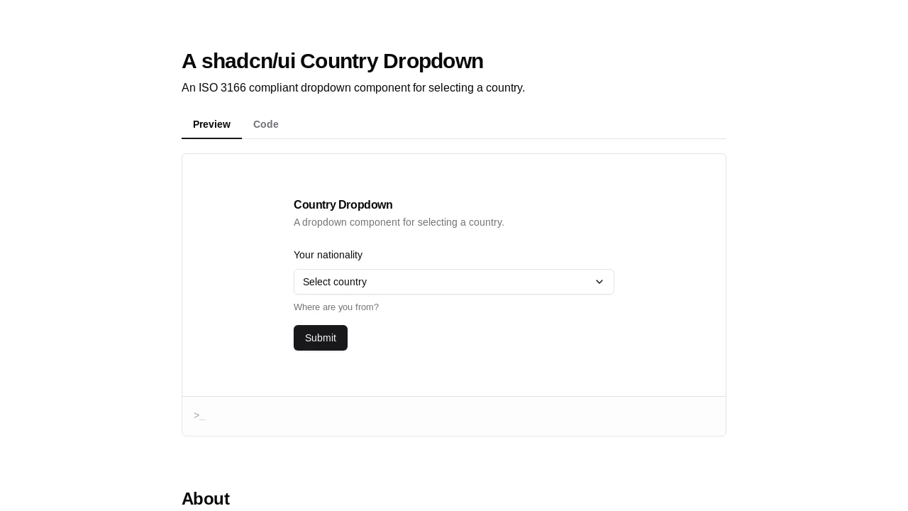
Shadcn/UI ISO 3166 Country Selector Dropdown
Enhance your forms with this React-based country dropdown component, specifically designed for shadcn/ui. It provides a fully ISO 3166 compliant country list, enabling users to effortlessly select their nationality or location. Built upon shadcn/ui's Popover and Command components, it offers a familiar user experience, complete with integrated search functionality and clear visual country flags. This component is developer-friendly, simplifying the process of adding robust country selection to modern web applications.
Features:
- ISO 3166 Compliance: Utilizes country data adhering to ISO 3166-1 alpha-2 and alpha-3 standards.
- Shadcn/UI Integration: Built with shadcn/ui's Popover and Command components for a consistent look and feel.
- Country Flag Display: Features circular country flags for easy visual identification, powered by
react-circle-flags. - Searchable Country List: Includes an input field allowing users to filter and search for countries by name.
- Customizable Placeholder: Supports a
placeholderprop to define custom text when no country is selected. - Default Value Setting: Allows pre-selecting a country using its
defaultValueprop (ISO alpha-3 code). - Disabled State: Provides a
disabledprop to easily enable or disable the dropdown functionality. - Slim Version: Offers a
slimprop for a compact display mode, showing only the country flag, ideal for internationalization toggles. - onChange Callback: Exposes an
onChangeevent that fires with the full selected country object upon selection. - Custom Country Options: Developers can supply a custom array of
Countryobjects via theoptionsprop. - ForwardRef Support: The component is compatible with
React.forwardReffor direct DOM element access. - Selected Item Indication: Clearly marks the currently selected country within the dropdown list using a check icon.
- Responsive Design: The dropdown list height is optimized for usability on various screen sizes.
- Client Component: Explicitly marked as a client component (
"use client") for Next.js and React Server Components environments.
Summary:
This country dropdown component for shadcn/ui empowers developers to quickly implement an ISO 3166 compliant country selection feature. It boasts integrated search, visual country flags, and various customization options such as a slim display and default value settings. Leveraging React and core shadcn/ui elements, it ensures a seamless user experience within applications built with this popular UI framework, streamlining the development of forms requiring country input fields with a ready-to-use, versatile solution.

Similar to shadcn-country-dropdown:
 SERP BLOCKS
