
shadcn-color-picker
A React component for integrating a sophisticated color picker into shadcn/ui projects, utilizing `react-color` for rich functionality and a disabled state option.
Integrate a Rich Color Picker with shadcn/ui and React
The shadcn-color-picker is a React component designed for developers looking to seamlessly integrate a versatile color selection tool into their shadcn/ui applications. Built upon the robust react-color library, it offers an intuitive user experience for choosing colors. This component simplifies the addition of color customization features, ensuring visual consistency and enhancing the interactivity of user interfaces within the shadcn/ui ecosystem, making it a valuable asset for modern web development.
Features:
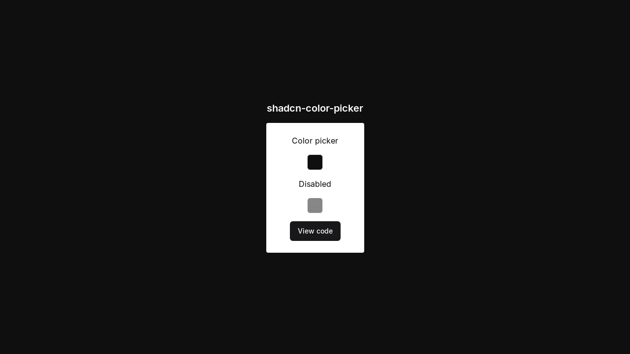
- Core Color Selection: Enables users to visually select colors for various application needs.
- shadcn/ui Compatibility: Specifically designed to integrate smoothly with the aesthetics and structure of shadcn/ui components.
- Powered by react-color: Leverages the extensive capabilities and various picker styles offered by the popular
react-colorlibrary. - Disabled State Support: Includes functionality for a disabled state, allowing developers to control user interaction with the color picker.
Summary:
This shadcn-color-picker component provides a straightforward solution for developers to embed a feature-rich and aesthetically pleasing color picker into projects using shadcn/ui and React. By harnessing the power of react-color, it delivers a reliable and customizable color selection experience. It's an ideal choice for enhancing user interfaces with dynamic color options, complete with essential functionalities like a disabled state, simplifying development workflows.

Similar to shadcn-color-picker:
 SERP BLOCKS
