
App Tailwind V4
A comprehensive suite of shadcn/ui components, updated for Tailwind v4 and React 19, for building modern, accessible web applications.
shadcn/ui with Tailwind v4: Next-Gen UI Components
This project showcases an adaptation of the popular shadcn/ui library, meticulously updated to integrate seamlessly with Tailwind CSS v4 and React 19. It offers developers a rich collection of beautifully designed, accessible, and highly customizable UI components. By leveraging these pre-built elements, you can significantly accelerate your development workflow, focusing on application logic while ensuring a polished and modern user experience consistent with the latest web standards.
Features:
- Accordion: Provides collapsible content sections, demonstrated with example questions about accessibility, styling, and animation.
- Alert: Displays important messages, such as guidance on adding components via CLI.
- AlertDialog: Presents modal dialogs for critical user interactions, initiated by a "Show Dialog" action.
- AspectRatio: A layout component for maintaining the aspect ratio of embedded content.
- Avatar: Component for displaying user profile pictures or initials, shown with "CN".
- Badge: Offers various visual styles for badges, including "Destructive", "Outline", and "Secondary".
- Breadcrumb: Navigational component displaying hierarchical paths like "Home > Components".
- Button: Includes diverse button styles such as "Destructive", "Ghost", "Link", and "Outline" for various actions.
- Calendar: An interactive calendar interface for date selection, exemplified with "February 2025".
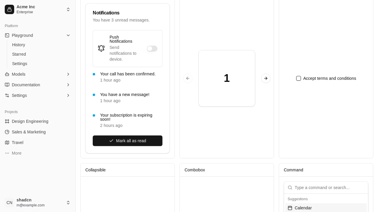
- Card: Container component for grouping related information, used for displaying "Notifications".
- Carousel: A slideshow component to display a series of items sequentially, numbered "1 2 3 4 5".
- Checkbox: Standard form element for toggling options, such as "Accept terms and conditions".
- Combobox: An input field combined with a dropdown list, allowing users to "Select framework...".
- DataTable (from Table): Displays structured data in rows and columns, as shown with "A list of your recent invoices."
- DatePicker: A UI element enabling users to "Pick a date" from a calendar interface.
Summary:
This resource provides a practical implementation of shadcn/ui components, specifically tailored for compatibility with Tailwind CSS v4 and React 19. It serves as an excellent reference and starter kit for developers aiming to build contemporary, responsive, and accessible user interfaces. With a wide array of pre-styled and customizable components, it streamlines the UI development process, allowing for faster project delivery and a focus on core application features.

Similar to App Tailwind V4:
 SERP BLOCKS
