Shadcn Multi Select Component
A React multi-select component for Next.js, leveraging shadcn/ui for customizable, searchable, and interactive option selection in modern web applications.
Advanced Multi-Select Component for shadcn/ui & Next.js
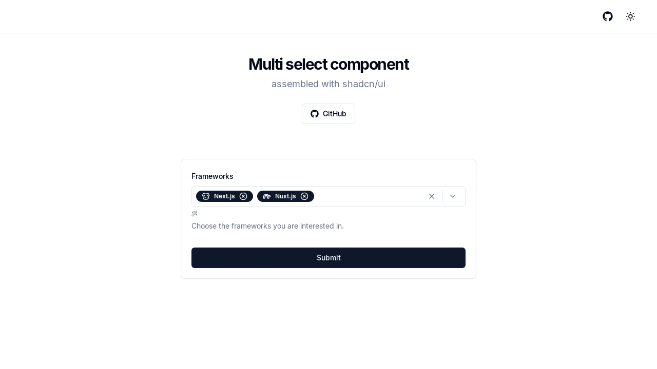
This component provides a sophisticated multi-select solution for Next.js projects utilizing the shadcn/ui library. It's constructed with core shadcn elements like Command, Popover, and Badge, ensuring a consistent look and feel. Developers can implement rich selection experiences, allowing users to choose multiple items from a list with advanced features like search, batch operations, and visual customization, enhancing data input and form usability.
Features:
- Configurable Options: Supply an array of items, each with a
label,value, and an optionaliconcomponent. - Selection Change Handling: Utilize the
onValueChangecallback to react to modifications in the selected values. - Initial Selection State: Set
defaultValueto pre-populate selected items upon component mount. - Informative Placeholder: Customize the
placeholdertext displayed when no items are chosen. - Animated Badges: Control badge animation duration using the
animationproperty for visual feedback. - Display Limit for Selections: The
maxCountprop determines how many selected items are shown before a summary badge appears. - Modal Popover Behavior: The
modalPopoveroption dictates if the popover disables interaction with external elements. - Visual Styling Variants: Choose from
default,secondary,destructive, orinvertedstyles via thevariantprop. - Integrated Search Filter: A
CommandInputallows users to quickly find options within the list. - Bulk Selection Toggle: A "(Select All)" option enables users to select or deselect all available items at once.
- Comprehensive Clear Functionality: Options to clear all selected items or just those exceeding the
maxCount. - Direct Item Deselection: Users can remove individual selections by clicking an 'X' icon on each badge.
- Keyboard Accessibility: Enhanced usability with keyboard controls, such as
Enterto open andBackspaceto deselect. - Icon Display Support: Incorporate custom icons next to option labels and within the selected item badges.
- Built with shadcn/ui Primitives: Leverages
Command,Popover,Button,Badge, andSeparatorfor a cohesive UI.
Summary:
The shadcn Multi-Select component offers a developer-friendly way to integrate advanced multi-selection features into Next.js applications. It combines the power of shadcn/ui with practical functionalities like dynamic options, search, customizable appearance, and animation. This tool is ideal for creating interactive forms and data selection interfaces that are both user-friendly and visually appealing, with robust control over selected states and display.

Similar to Shadcn Multi Select Component:
 SERP BLOCKS
