
Shadcn Calendar Component
A Next.js calendar date picker component built with shadcn/ui, offering single and range selection with timezone support and interactive date adjustments.
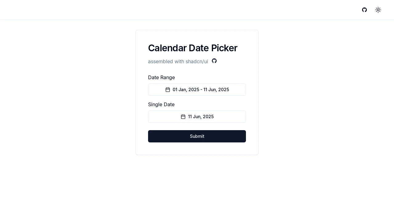
Enhanced Calendar Date Picker for Next.js with Shadcn/UI
This Next.js component provides a versatile calendar date picker, leveraging the power of shadcn/ui for a clean and modern interface. It supports both single date and date range selections, making it suitable for various applications. Developers can easily integrate this component to manage date inputs with features like timezone awareness, customizable month display, predefined date ranges, and interactive date part adjustments via mouse scroll.
Features:
- Client-Side Rendering: Designed as a "use client" component for Next.js applications.
- Date Range and Single Date Selection: Supports selection of both date ranges (with two-month view) and single dates (with single-month view).
- Shadcn/UI Integration: Built using shadcn/ui components like Button, Calendar, Popover, and Select for a consistent look and feel.
- Timezone Awareness: Utilizes date-fns-tz for robust timezone handling, ensuring dates are correctly interpreted and formatted according to the user's local timezone.
- Customizable Month Display: Option to display one or two months in the calendar view via the
numberOfMonthsprop. - Year Range Configuration: Allows defining the range of years available in the year selector dropdowns through the
yearsRangeprop. - Predefined Date Ranges: Offers quick selection for common ranges such as "Today", "This Week", "This Month", and "This Year" when
numberOfMonthsis set to 2. - Interactive Date Part Adjustments: Date components (day, month, year) in the trigger button highlight on hover and can be incrementally changed using the mouse wheel.
- Month and Year Selectors: Dropdown selectors within the popover for easily navigating to specific months and years for both 'from' and 'to' dates in range mode.
- Callback on Selection: Provides an
onDateSelectcallback function that is triggered when a date or date range is chosen, returning the selectedfromandtodates. - Popover Control: Includes an option to automatically close the popover on date selection using the
closeOnSelectprop. - Styling Variants: Leverages
class-variance-authority(cva) for customizable button appearance through thevariantprop (e.g., default, destructive, outline). - Iconography: Uses
lucide-reactfor icons, such as the CalendarIcon in the trigger button. - Responsive Design Elements: Adapts UI elements like predefined range buttons and month/year selectors based on screen size.
- Dynamic Date Formatting: Displays selected dates in a user-friendly format (e.g., "dd LLL, y") in the trigger button, respecting timezones.
Summary:
This shadcn/ui based Calendar Date Picker component for Next.js offers developers a highly interactive and customizable solution for date selection. It supports single dates and ranges, features timezone handling, predefined ranges for quick selection, and intuitive navigation through month/year selectors and direct mouse wheel interactions on the displayed date. It's designed for easy integration into modern web applications requiring sophisticated date input capabilities with a polished UI.

Similar to Shadcn Calendar Component:
 SERP BLOCKS
