
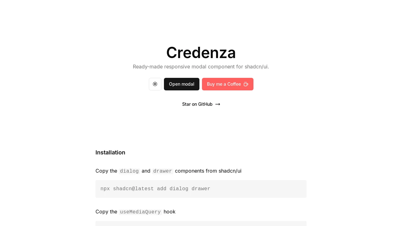
Credenza
Credenza provides a ready-to-use, responsive modal component for shadcn/ui, adapting between dialog and drawer views for optimal cross-device user experience.
Credenza: Adaptive Modal Component for shadcn/ui
Credenza offers a developer-focused, responsive modal solution tailored for integration with shadcn/ui. It dynamically adjusts its presentation, appearing as a conventional dialog on desktop screens and transforming into an accessible drawer on mobile devices. This component is constructed using shadcn/ui's foundational dialog and drawer elements, which themselves are built upon Vaul, ensuring a polished and consistent user interaction across various viewports. Credenza simplifies modal development in React projects by offering a singular, cohesive API for these dual display modes.
Features:
- Responsive Behavior: Automatically transitions between a Dialog (desktop) and a Drawer (mobile) component based on a 768px viewport breakpoint.
- shadcn/ui Native: Designed as a direct extension for projects already utilizing the shadcn/ui component ecosystem.
- Unified API: Provides a consistent set of sub-components like
CredenzaTrigger,CredenzaContent, andCredenzaHeaderfor both modal styles. - Vaul-Powered Drawer: Implements the mobile drawer using
Vaul, ensuring fluid animations and touch-friendly interactions. - Flexible Installation: Offers installation via the shadcn registry for quick setup or manual code integration for more control.
useIsMobileHook: Employs a dedicated React hook to detect mobile screen sizes and trigger the responsive switch.- State-Driven Control: Supports programmatic control over visibility through
openandonOpenChangeprops, facilitating integration with application state. asChildProp Composability: Leverages theasChildprop, common in shadcn/ui, for flexible rendering of trigger and action elements.- Optional Background Scaling: Supports an aesthetic background scaling effect for the drawer view when the main application layout includes
vaul-drawer-wrapper. - Client-Side Ready: Built as a "use client" component, making it suitable for Next.js App Router and other client-rendering React environments.
- Structured Content Components: Includes
CredenzaBody,CredenzaTitle,CredenzaDescription, andCredenzaFooterfor well-organized modal content.
Summary:
Credenza is a React component designed to simplify the creation of responsive modals within shadcn/ui applications. It intelligently handles the switch between dialog and drawer presentations based on screen size, providing developers with a unified and easy-to-use API. This approach ensures that modals are both aesthetically pleasing and functionally intuitive on desktops and mobile devices alike, building upon the robust foundations of shadcn/ui and Vaul to streamline UI development.

Similar to Credenza:
 SERP BLOCKS
