
Radix UI
Radix Primitives is an open-source, low-level UI component library focused on accessibility, customization, and developer experience for building design systems and web apps.
Radix Primitives: Accessible UI Components for Design Systems and Web Apps
Radix Primitives is a low-level, open-source UI component library meticulously designed for developers. It prioritizes accessibility, customization, and an optimal developer experience. These primitives serve as foundational building blocks for creating high-quality design systems and sophisticated web applications. You can integrate them as the base of your system or adopt components incrementally, ensuring flexibility in your development workflow and enhancing user interface quality.
Features:
- Accessibility Core: Built with WAI-ARIA guidelines, ensuring screen reader compatibility and full keyboard navigation.
- Unstyled Foundation: Components are delivered unstyled, offering a blank canvas for any design system or styling solution without CSS conflicts.
- Highly Composable: Provides granular access to each component part, enabling flexible and custom UI compositions.
- Extensively Customizable: Allows deep configuration of behavior, state management, focus control, and event handling for each primitive.
- Superior Developer Experience: Features a fully-typed API, consistent across all components, backed by comprehensive documentation and TypeScript support.
- Incremental Adoption Strategy: Each component is an independently versioned package, allowing gradual integration into existing projects.
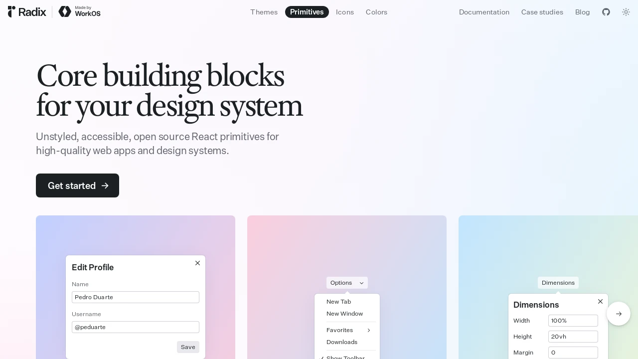
- Dialog Primitive: Offers modal and non-modal dialogs with robust focus control and accessibility.
- Dropdown Menu Primitive: Supports nested submenus, checkable items, collision detection, arrow key navigation, and typeahead functionality.
- Popover Primitive: Includes fine-grained focus management, collision handling, and animations aware of origin and collisions.
- Slider Primitive: Provides support for keyboard and touch inputs, custom step intervals, multiple thumbs for ranges, and RTL layouts.
- Scroll Area Primitive: Allows custom cross-browser styling while retaining native scrolling behavior and performance.
- Tabs Primitive: Supports arrow key navigation, horizontal/vertical orientations, and both controlled and uncontrolled state management.
- Accordion Primitive: Enables single or multiple item expansion, keyboard navigation, and smooth collapse/expand animations.
- Advanced Focus Management: Implements sensible focus handling by default, with options for further customization to meet specific needs.
- Rich Primitive Set: Includes additional components like Radio Group, Toggle Group, and Switch for comprehensive UI development.
Summary:
Radix Primitives offers a suite of low-level, unstyled UI components for React, prioritizing accessibility, customization, and developer experience. It enables developers to build high-quality, accessible design systems and web applications efficiently. With features like fine-grained control, composability, and incremental adoption, Radix Primitives serves as a robust foundation for modern user interface development, saving time and effort while ensuring best practices in accessibility.

Similar to Radix UI:
 SERP BLOCKS
