Primitives
An unofficial Angular port of Radix UI, offering low-level, accessible, and customizable UI primitives for building high-quality design systems and web apps.
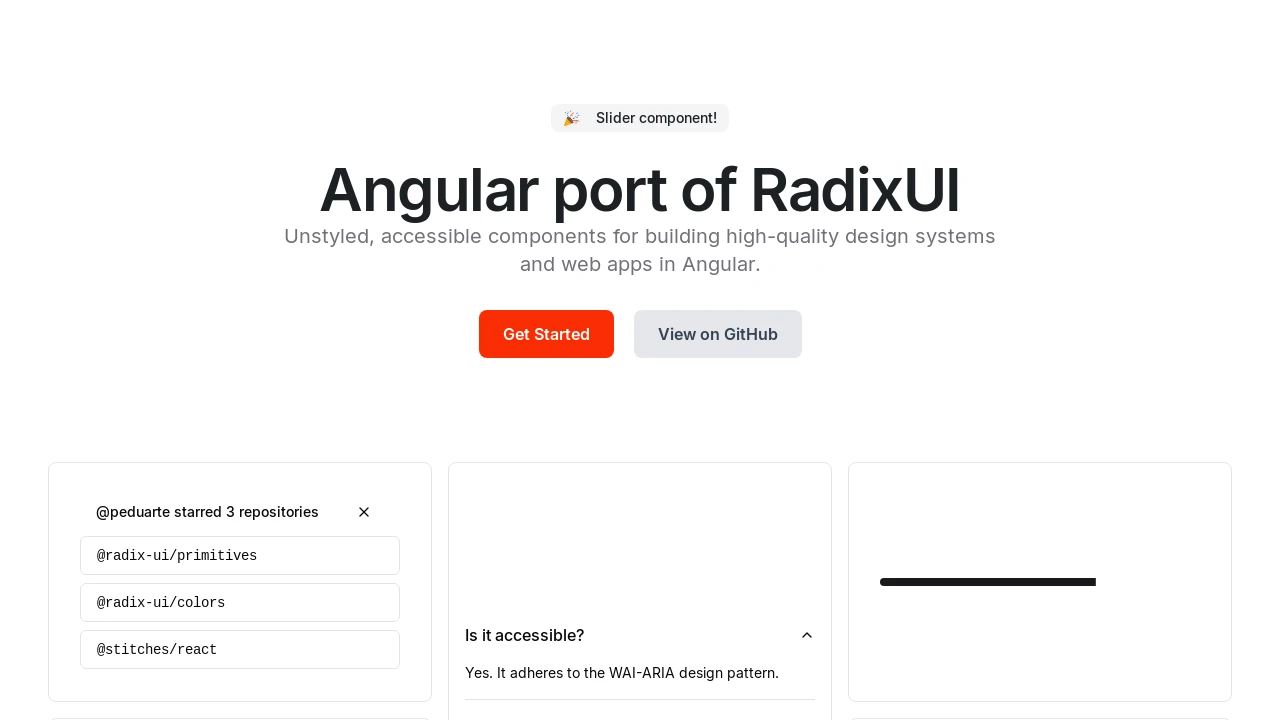
Radix Angular: Accessible & Customizable UI Primitives for Angular
Radix Angular is an unofficial Angular adaptation of the acclaimed Radix UI, providing a comprehensive suite of low-level UI component primitives. It emphasizes accessibility, extensive customization options, and an enhanced developer experience. Developers can leverage these foundational components to construct their own design systems or integrate them incrementally into existing Angular applications, ensuring high-quality and accessible user interfaces. Some primitives are also based on @angular/cdk.
Features:
- Accordion: A vertically stacked set of interactive headings that reveal content sections.
- Avatar: Displays an image representation of a user with fallbacks.
- Checkbox: A control for toggling between checked and unchecked states.
- Dialog: A modal window overlaid on the primary content to display information or require user interaction.
- DropdownMenu: Displays a menu to the user — such as a set of actions or functions — triggered by a button.
- Hover Card: A card that appears when a user hovers over a trigger element, displaying additional information.
- Popover: A transient view that appears above other content, often used for contextual information or actions.
- Progress: Displays an indicator showing the completion progress of a task.
- Radio Group: A set of checkable buttons, where no more than one button can be checked at a time.
- Select: Allows users to choose an option from a pre-defined list (currently in beta).
- Slider: Allows users to select a value from a continuous or discrete range.
- Switch: A control that allows the user to toggle between two states, typically on or off.
- Tabs: Organizes content into multiple sections that can be switched between.
- Tooltip: A popup that displays information related to an element when hovered or focused.
- Calendar: A component for selecting dates from a calendar view.
Summary:
Radix Angular offers developers an Angular-specific implementation of Radix UI's accessible and customizable low-level component primitives. It aims to maintain API compatibility with the original Radix, enabling the creation of robust design systems and web applications. By focusing on unstyled base components, it provides maximum flexibility and control over styling, while ensuring a strong foundation in accessibility and developer experience, with some components leveraging @angular/cdk.

Similar to Primitives:
 SERP BLOCKS
