

PaceUI
PaceUI offers copy-and-customize React components, animated crafts, blocks, templates and starters for Next.js and TanStack Start, built with shadcn and Base UI.
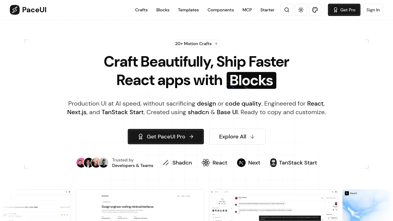
PaceUI: React UI Built with shadcn and Base UI
PaceUI is a React UI collection for Next.js and TanStack Start, created with shadcn and Base UI. Its catalog is split into crafts (small animated interactions), blocks for dashboards and marketing pages, complete templates such as an admin dashboard and an AI support app, and more than 100 component variants. Code is meant to be copied into a project and customized. PaceUI also provides an MCP server so IDE agents can browse the catalog and insert code, plus a full-stack starter with auth, payments, AI and database integrations. Its GSAP animation components are open source under the MIT license, while other parts are sold as PaceUI Pro.
Features:
- Animated Crafts: Small motion components such as a voice record button, a rolling image bento and a heart burst button.
- Layout Blocks: Everyday sections, including stat blocks, for dashboards, marketing pages and web apps.
- Templates: Finished apps and landing pages, including an admin dashboard and an AI support template.
- Component Variants: More than 100 variants of core components, including motion and AI-focused options.
- MCP Server: Lets IDE agents explore the catalog and drop code straight into a project.
- Full-Stack Starter: A starter kit with authentication, payments, AI and database integrations.
- Open-Source GSAP Components: An MIT-licensed repository of GSAP animation components documented on the PaceUI site.
Distribution:
opensource
GitHub:
282 Stars
18 Forks
Categories:

Similar to PaceUI:
 SERP BLOCKS

