

OnSystem
OnSystem sells shadcn-compatible React and Tailwind CSS component kits for internal tools, fintech and e-commerce screens, with shared tokens and an AI context pack.
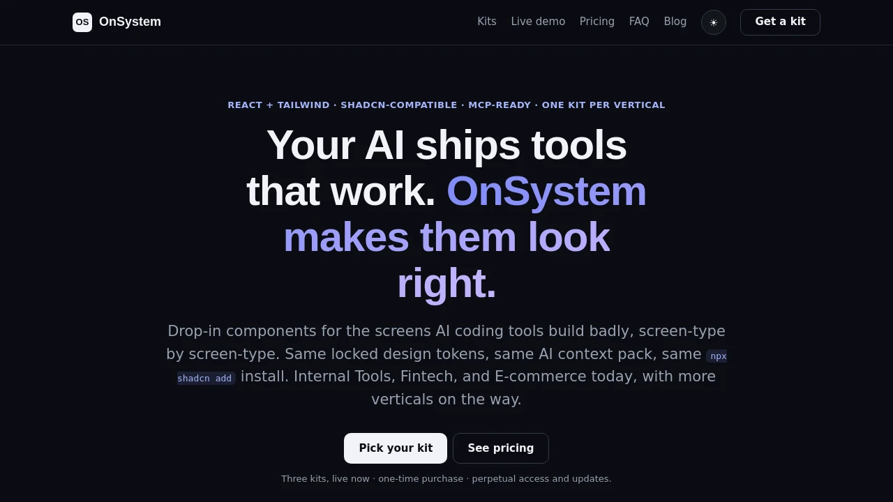
OnSystem: Vertical Component Kits for shadcn Projects
OnSystem is a set of paid React and Tailwind CSS component kits that are compatible with shadcn/ui and install with npx shadcn add. Each kit targets one kind of product screen: Internal Tools covers data tables, CRUD forms, dashboards and permission-gated views; Fintech covers masked balances, transaction lists, invoices and transfer confirmations; and E-commerce covers orders, inventory, variants and refunds. All kits share the same semantic design tokens, five themes and an AI context pack, and they are MCP-ready so tools such as Claude Code or Cursor can add components. Kits are sold as one-time purchases, individually or as an All Access bundle.
Features:
- Internal Tools Kit: Data tables, CRUD forms, dashboards and permission-gated views for ops screens.
- Fintech Kit: Masked balances, reconciled transaction lists, invoice generation and transfer confirmation.
- E-commerce Kit: Merchant back-office screens for orders, inventory, variants and refunds.
- Shared Design Tokens: Every kit uses the same semantic tokens and five themes.
- AI Context Pack: Guidance files that help AI coding tools use the components correctly.
- MCP-Ready: Claude Code or Cursor can add components through MCP.
- shadcn CLI Install: Components install with npx shadcn add from a registry namespace.
Distribution:
premium
Categories:

Similar to OnSystem:
 SERP BLOCKS

