UI
fellipeutaka/ui offers an accessible, customizable Design System built with shadcn/ui components, easily integrated into Tailwind CSS projects for streamlined development.
fellipeutaka/ui: Customizable Design System with shadcn/ui Components
fellipeutaka/ui provides a robust Design System featuring accessible and customizable components, leveraging the power of shadcn/ui. Developers can quickly install the necessary packages, extend their Tailwind CSS configuration, and import the theme. This system is designed for easy theming through CSS variables, allowing for deep personalization of both light and dark modes to match any project's aesthetic requirements, ensuring a consistent and modern user interface.
Features:
- Simplified Installation: Get started quickly by installing
@fellipeutaka/ui,@fellipeutaka/styles, andlucide-reactwith pnpm. - Tailwind CSS Theme Extension: Easily integrate the design system's theme into your existing Tailwind CSS setup using
defineTailwindConfig. - Global CSS Import: A single
@importstatement in your global CSS file sets up the default theme (@fellipeutaka/styles/theme.css). - Ready-to-Use Components: Import and utilize pre-built components like
Buttondirectly in your application (e.g.,import { Button } from "@fellipeutaka/ui/button";). - CSS Variable-Driven Customization: Extensively customize the look and feel by overriding CSS variables for both light (
:root) and dark (.dark:root) themes. - Comprehensive Theme Variables: Fine-tune a wide array of aspects including background, foreground, muted states, popovers, borders, inputs, cards, primary/secondary/accent/destructive colors, ring effects, and corner radius (
--radius). - Built-in Dark Mode Support: Includes a full set of CSS variables specifically for dark mode, typically activated via a
.darkclass on a root element. - Enhanced Body Styling: Applies essential global styles for background, text color, antialiasing, and OpenType font features (
font-feature-settings). - Custom WebKit Scrollbars: Provides styled scrollbars (
::-webkit-scrollbar,::-webkit-scrollbar-thumb) for a more integrated visual experience in WebKit-based browsers. - Browser Style Resets: Includes resets for browser-default styles on autofill inputs (
:autofill) and color swatches (::-webkit-color-swatch,::-moz-color-swatch) for improved cross-browser consistency. - Powered by shadcn/ui: Built upon the solid foundation and popular component primitives of shadcn/ui, ensuring quality and familiarity.
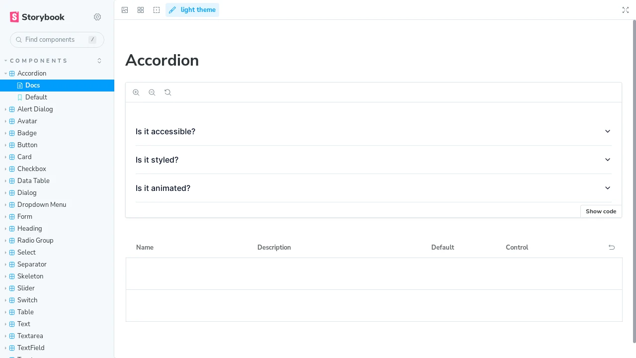
- Accessibility Focused: Components are designed with accessibility in mind, as highlighted in the original description.
- Storybook Integration: Components are showcased and likely developed using Storybook, as indicated by demo environment information.
Summary:
fellipeutaka/ui is a Design System offering developers a collection of accessible and highly customizable UI components built upon shadcn/ui. It simplifies front-end development through easy integration with Tailwind CSS, providing a comprehensive set of theming options via CSS variables for both light and dark modes. This allows for the creation of consistent and visually appealing user interfaces with minimal setup and extensive personalization capabilities to fit diverse project needs.

Similar to UI:
 SERP BLOCKS

