
UI Builder
A React component offering a Figma-style visual editor to build UIs using your component library, compatible with shadcn/ui and custom components.
UI Builder: Visual React UI Creation with Existing Components
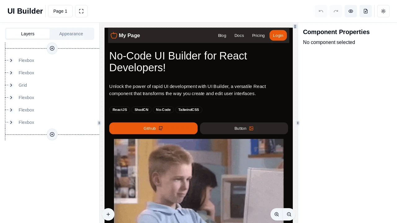
UI Builder is a powerful React component that integrates a Figma-style visual editor directly into your application. It empowers both developers and non-technical users to compose user interfaces, emails, dashboards, and white-label views by leveraging your existing React component library, including shadcn/ui elements. Layouts are stored as structured JSON, facilitating straightforward version control and enabling dynamic rendering with live data, thereby significantly streamlining the UI development and update lifecycle for your projects.
Features:
- Visual Editor Integration: Adds a Figma‑style editor directly into your product for intuitive UI design.
- Uses Existing React Components: Leverages your current component library, eliminating the need to rebuild elements from scratch.
- Shadcn/ui Compatibility: Designed as a shadcn/ui package, seamlessly integrating with its components and theming.
- JSON Layout Storage: Saves UI layouts as human-readable JSON, enabling easy versioning, storage, and dynamic rendering.
- Dynamic Data Binding: Allows creation of data-driven interfaces by binding component properties to variables for personalized content.
- No-Code UI Composition: Empowers non‑developers and team members to build and modify UIs without writing code.
- Component Registry System: Define and manage available components through a registry specifying the React component, its Zod schema for props, and import path.
- Props Editing with Auto-Form: Automatically generates forms for editing component properties based on their Zod schemas.
- Layer-Based Canvas: Construct UIs as a hierarchical tree of component layers with direct manipulation on an interactive canvas.
- LayerRenderer Component: Render saved layouts independently of the full editor, with support for runtime variable overrides.
- Customizable Editor Panels: Offers options to configure various editor panels, including navigation, layers, properties, and page configuration tabs.
- Optional Local Storage Persistence: Provides the choice to persist the editor's state (layers and configurations) in browser local storage or manage state externally.
- Variable Management: Supports defining and editing typed variables (string, number, boolean) to make UIs dynamic and reusable.
- React Code Generation: Enables exporting visually designed page structures as clean, readable React code, referencing your components.
- Extensible Field Overrides: Customize the auto-generated forms for component properties to enhance the editing experience (e.g., custom input types, labels).
Summary:
UI Builder provides a drop-in visual editor for React applications, facilitating the creation and modification of user interfaces using your established component library. It supports dynamic content through variables, stores layouts in JSON format, and allows for rendering these layouts independently of the editor. This tool empowers teams to build and iterate on UIs rapidly, bridging the gap between design and development by directly utilizing production-ready components for efficient workflows and collaborative efforts.
Tags:

Similar to UI Builder:
 SERP BLOCKS
