
Shadcn Color Picker
A React color picker component built with shadcn/ui and react-colorful, offering a seamless and customizable color selection experience for developers.
Enhance Your UI with a shadcn and React-Colorful Powered Color Picker
This developer-centric color picker component seamlessly integrates into React applications. By combining the aesthetic appeal of shadcn/ui with the robust functionality of react-colorful, it offers a polished and user-friendly solution for color selection. It's an excellent choice for developers looking to add sophisticated color interactivity to their projects efficiently, providing a customizable and modern tool that enhances the user experience without requiring extensive setup or boilerplate code.
Features:
- Built with shadcn/ui: Leverages shadcn/ui's design system and component patterns for a modern UI.
- Powered by react-colorful: Utilizes react-colorful for core color selection logic.
- React Component: Reusable component for easy integration in React projects.
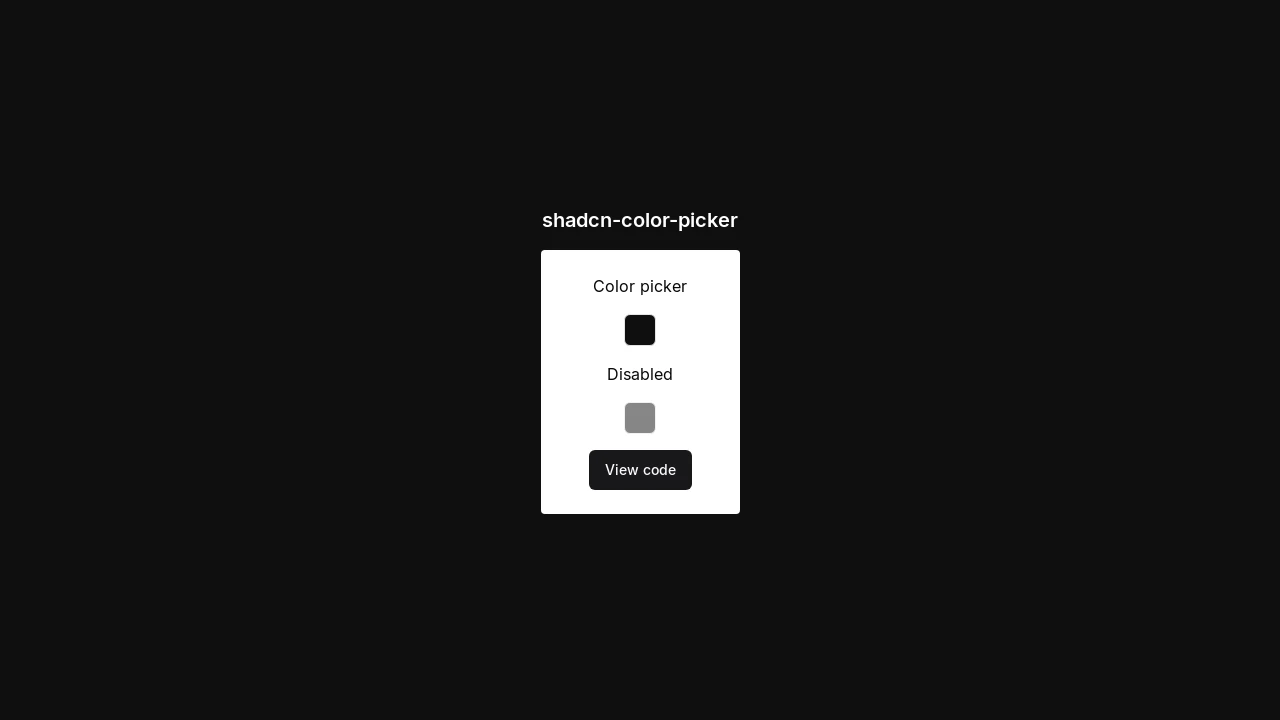
- Disabled State: Supports a disabled state for controlled user interaction, as indicated by the demo.
- Source Code Available: Full source code provided for transparency and potential customization via the GitHub link.
- Interactive Demo: A live demo showcases functionality and appearance, accessible online.
Summary:
The shadcn-color-picker offers a practical and elegant solution for implementing color selection in React applications. It combines shadcn/ui's styling with react-colorful's engine, resulting in a component that is both easy to integrate and visually appealing. Developers can benefit from its straightforward implementation, available source code for deeper customization, and a live demo for quick evaluation, making it a valuable asset for projects requiring a refined color input mechanism.

Similar to Shadcn Color Picker:
 SERP BLOCKS
