
mynaui
MynaUI is a comprehensive UI kit powered by TailwindCSS, shadcn/ui, and Radix UI, designed for Figma and React/Next.js development workflows.
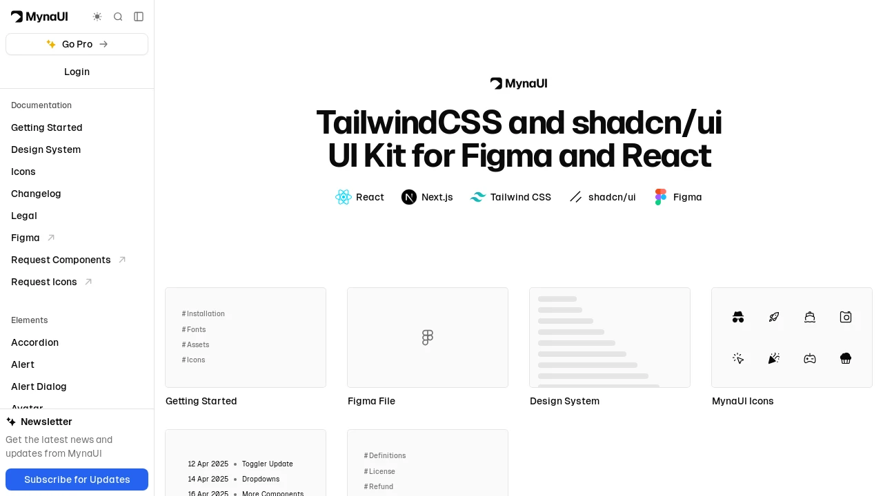
MynaUI: Streamline UI Development with a TailwindCSS & shadcn/ui Kit
MynaUI provides an extensive collection of UI components, meticulously built using TailwindCSS, shadcn/ui, and Radix UI. It facilitates a cohesive design-to-development pipeline, offering assets for Figma and ready-to-use components for React and Next.js projects. This UI kit empowers developers and designers to craft visually appealing, modern, and highly functional user interfaces with greater speed and consistency, enhancing the overall development lifecycle.
Features:
- Accordion Components: Interactive, collapsible sections for organizing content efficiently.
- Alerts & Alert Dialogs: For displaying important messages and critical confirmation dialogs.
- Avatar & Avatar Groups: Components for displaying user profile images, individually or grouped.
- Button & Button Groups: A variety of button styles and components for grouping related actions.
- Calendar & Date Picker: Intuitive interfaces for date selection and calendar display.
- Data Table Component: For presenting and managing structured tabular data with clarity.
- Dialog & Drawer Components: Modal and non-modal overlays for focused content, forms, or navigation.
- Dropdown Menu & Menubar: For creating application navigation menus and contextual action lists.
- Comprehensive Form Elements: Includes Checkbox, Date Picker, Input, OTP Input, Radio, Select, Slider, Switch, and Textarea.
- Marketing Components: Pre-designed elements like Banners, Blog Layouts, Call to Action sections, FAQ, and Hero units.
- Application UI Components: Includes App Headers, Card Headers, Containers, and Empty State placeholders.
- Authentication Screens: Pre-built UI templates for Login, Registration, and Forgot Password flows.
- Toast & Tooltip: For providing non-intrusive user feedback and contextual information hints.
- Loading State Indicators: Includes Skeleton Loaders and Spinners for better user experience during data fetching.
- Figma Design Assets: A corresponding UI kit available in Figma to ensure design and development consistency.
Summary:
MynaUI is a robust UI kit built with TailwindCSS, shadcn/ui, and Radix UI, offering a wide array of pre-designed components for Figma and React/Next.js. It accelerates the development of modern, consistent user interfaces by providing elements for forms, marketing pages, and application layouts. This comprehensive toolkit streamlines the process from initial design in Figma to final implementation in code, catering to diverse project needs.

Similar to mynaui:
 SERP BLOCKS
