UI
An npm package offering components from shadcn/ui for easier integration. Note its versioning is independent of shadcn/ui component updates.
@lshay/ui: Packaged Shadcn/UI Components for Your Projects
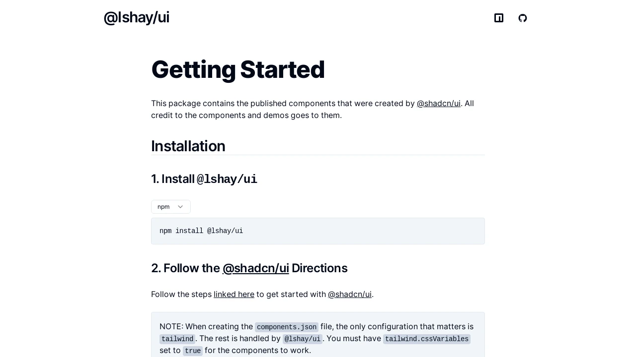
@lshay/ui provides a convenient npm package containing the versatile and accessible components from the popular shadcn/ui library. This allows developers to easily integrate these well-crafted UI elements into their applications. It's important to note that the versioning of this package is independent and does not directly correspond to updates in the original shadcn/ui components. For comprehensive guides and component specifics, please consult the documentation linked on the project website.
Features:
- Pre-packaged Component Collection: Offers a curated set of UI components sourced directly from the shadcn/ui library, ready for use.
- NPM Package Distribution: Facilitates straightforward installation and project integration via its availability as an npm package under @lshay/ui.
- Independent Versioning System: The package's versions are managed separately and do not directly reflect updates or changes to the core shadcn/ui components.
- Dedicated Documentation Site: A specific website is provided, offering comprehensive documentation for the packaged components and their effective usage.
Summary:
@lshay/ui simplifies the incorporation of shadcn/ui components by delivering them as a readily installable npm package. This tool is tailored for developers who want to leverage shadcn/ui's robust design and functionality without the need to manage individual component source files directly. While the package follows its own versioning, detailed information on components and their implementation is available through its dedicated documentation, ensuring users can fully utilize these UI resources.

Similar to UI:
 SERP BLOCKS
