
Shadow Panda
Shadow Panda offers accessible, customizable UI components for Panda CSS users, mirroring shadcn/ui and built with Radix for modern web development.
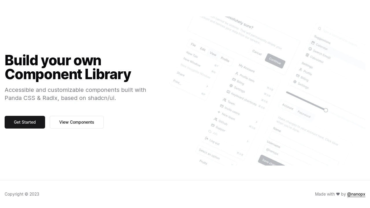
Shadow Panda: Panda CSS Components Inspired by shadcn/ui
Shadow Panda provides a collection of UI components specifically designed for developers using Panda CSS. It serves as an alternative to Tailwind CSS-based libraries, drawing significant inspiration from the popular shadcn/ui. By leveraging Panda CSS and Radix UI, Shadow Panda aims to deliver accessible and customizable components, enabling developers to build modern user interfaces efficiently. It includes a Panda CSS preset for straightforward integration and offers a familiar component set for those accustomed to shadcn/ui, facilitating a smooth transition for Panda CSS adopters.
Features:
- Panda CSS Preset: Integrates directly into Panda CSS configurations using
@shadow-panda/presetfor styling. - shadcn/ui Component Parity: Provides a component set analogous to shadcn/ui, tailored for Panda CSS.
- Radix UI Primitives: Utilizes Radix UI for core accessibility and unstyled primitive components.
- React Compatibility: Specifically configured for use with the React JavaScript framework.
- Style Context Utility: Includes
@shadow-panda/style-context, a utility package for component styling. - Optional CSS Reset: Supports enabling a global CSS reset via Panda CSS's
preflightoption. - Style Package Emission: Optionally emits generated styles as
@shadow-panda/styled-systemfor cleaner imports. - Copy-Paste Integration: Facilitates easy integration of components into projects via copy-pasting code.
- Accessibility Focus: Components are designed with accessibility as a primary consideration.
- Customizability: Offers customizable components to align with diverse project aesthetics.
- Comprehensive Documentation: Features a dedicated website with detailed usage guides and examples.
Summary:
Shadow Panda is a UI component library tailored for developers utilizing Panda CSS, offering a suite of accessible and customizable components heavily inspired by shadcn/ui and built upon Radix UI. It streamlines development by providing a dedicated Panda CSS preset and a familiar component architecture, allowing for rapid integration and the construction of contemporary user interfaces. This tool positions itself as a direct Panda CSS equivalent to the widely-used shadcn/ui library, catering to the growing Panda CSS ecosystem.

Similar to Shadow Panda:
 SERP BLOCKS
