
Date Range Picker For Shadcn
Reusable Shadcn DateRangePicker using Radix UI & Tailwind CSS, featuring presets, text entry, calendar selection, and date comparison.
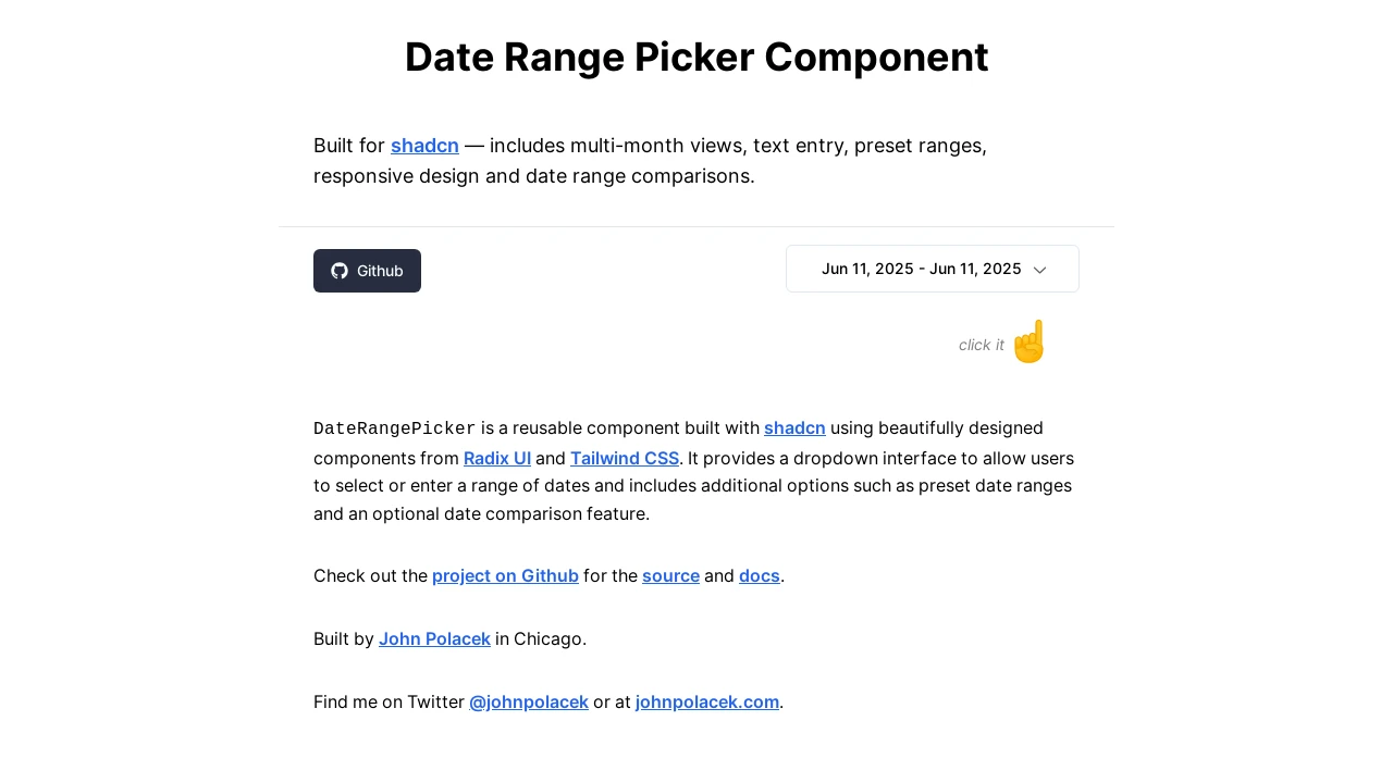
Advanced DateRangePicker Component for Shadcn UI
The DateRangePicker is a versatile and reusable component designed specifically for Shadcn UI applications. It leverages the robust capabilities of Radix UI and the styling flexibility of Tailwind CSS to provide a seamless user experience. Developers can easily integrate this component to allow users to select date ranges through a user-friendly dropdown interface, which supports text input, calendar views, preset date options, and an optional date comparison feature for enhanced data analysis.
Features:
Preset Date Ranges: Offers predefined common date ranges (e.g., Today, Last 7 days) for quick selection.Text Entry: Allows users to manually type in start and end dates for the selected range.Calendar Selection: Provides an interactive calendar interface for visually picking date ranges.Multi-Month Views: Displays multiple months within the calendar for easier navigation across longer periods.Date Comparison: Includes an optional feature to select and compare a secondary date range against the primary one.Shadcn UI Integration: Specifically designed as a reusable component for projects utilizing the Shadcn UI library.Radix UI Primitives: Built upon core Radix UI components, ensuring accessibility and foundational logic.Tailwind CSS Styling: Styled with Tailwind CSS, making it easily customizable to fit the look and feel of Tailwind-based projects.Customizable Initial Dates: Allows developers to set default start and end dates for both the main and comparison ranges upon initialization.onUpdate Callback: Provides a function that is triggered when the date range is selected or modified, returning the new date values to the parent application.Locale Support: Supports various locales (e.g., 'en-US', 'en-GB') for international date formatting and display.Responsive Design: Adapts its layout for optimal viewing and interaction on different screen sizes, including mobile and desktop.Configurable Popover Alignment: Allows adjustment of the dropdown popover's alignment relative to the trigger button.
Summary:
This DateRangePicker component enhances Shadcn applications by providing a comprehensive solution for date range selection. It combines a user-friendly interface with powerful features like preset ranges, direct text input, visual calendar selection, and an optional date comparison tool. Built with Radix UI and Tailwind CSS, it offers developers a customizable and easy-to-integrate component for managing date inputs effectively in their projects.

Similar to Date Range Picker For Shadcn:
 SERP BLOCKS
