
Enhanced Button
Upgrade shadcn-button with diverse, eye-catching styles and practical features, simplifying development with minimal code and easy integration.
Enhanced Shadcn Button: Advanced Styles & Features for React
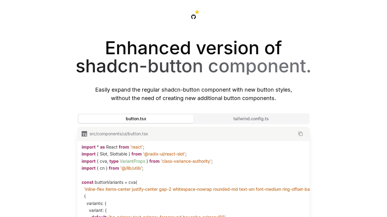
The enhanced-button component offers a significant upgrade to the standard shadcn-button, designed for developers using React and Tailwind CSS. It seamlessly integrates into existing shadcn-ui projects, enriching them with a collection of new visual styles and interactive effects. This extension allows for the creation of more dynamic and engaging user interface elements with minimal setup, eliminating the need to develop and manage multiple custom button components for various aesthetic requirements. Installation is straightforward, involving simple code replacement and minor Tailwind configuration adjustments.
Features:
- Expandable Icon: An icon dynamically reveals itself on hover, smoothly adjusting the button's width.
- Hover Ring Accent: A subtle ring elegantly appears around the button upon mouseover, providing clear interactive feedback.
- Persistent Shine Animation: A continuous, gentle light sweep effect animates across the button’s surface for a polished look.
- Hover-Activated Shine: A light sweep animation is triggered specifically when the mouse hovers over the button.
- Gooey Right Flow: A fluid, captivating background effect animates from the right side of the button on hover.
- Gooey Left Flow: A similar fluid background effect animates from the left side of the button on hover.
- Animated Retracting Underline: A decorative underline effect that gracefully animates away as the user hovers.
- Animated Appearing Underline: A decorative underline that smoothly animates into view when the user hovers.
- Flowing Gradient Background: Implements a continuously animating multi-color gradient that flows across the button.
- Flexible Icon Positioning: Provides the ability to place icons either to the left or right of the button's text content.
- Direct Shadcn UI Enhancement: Functions as a drop-in replacement for the standard
button.tsxfile in shadcn-ui projects. - Tailwind CSS Keyframe Integration: Leverages custom keyframes and animations, easily configured within
tailwind.config.ts. - Effect Combination: New visual effects can be readily combined with existing shadcn button variants such as 'outline' or 'secondary'.
- Standard Sizing Options: Fully supports the standard shadcn button sizes: default, small (sm), large (lg), and icon.
- Composition via
asChild: Utilizes Radix UI's Slot component for flexible rendering, allowing the button to act as a child element.
Summary:
This enhanced-button component extends the default shadcn-button by introducing a suite of visually appealing animations and functional improvements, such as dynamic icon expansion and hover effects. It is tailored for developers working with React, Tailwind CSS, and shadcn-ui, offering a simple method to elevate user interfaces. By replacing the existing button component and adding straightforward Tailwind configurations, users gain access to these enriched styles without requiring extensive custom development, streamlining the process of creating more interactive buttons.

Similar to Enhanced Button:
 SERP BLOCKS
