
Shadcn Country Region Select
A Shadcn-styled select input component for countries and regions, offering customization and out-of-the-box modern design for web applications.
Shadcn Country & Region Select: Customizable Location Inputs
Shadcn Country & Region Select provides developers with ready-to-use, stylistically consistent input components for selecting countries and their corresponding regions. Built upon the Shadcn design system, these components integrate seamlessly into projects requiring location-based user input. They offer a blend of out-of-the-box modern aesthetics and customization options, allowing for tailored user experiences while maintaining a sleek design language. This is ideal for forms needing accurate geographical data entry.
Features:
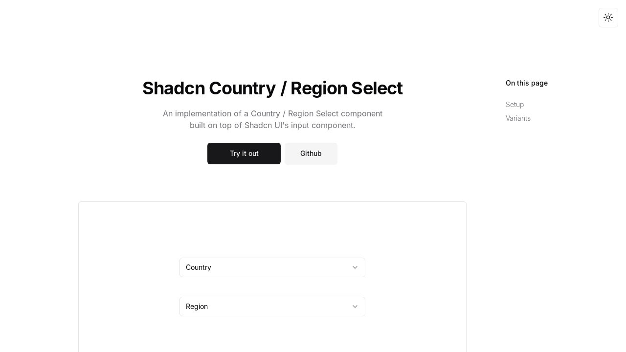
- CountrySelect Component: Provides a dedicated
CountrySelectcomponent for selecting countries. - RegionSelect Component: Offers a
RegionSelectcomponent for selecting regions, dynamically populated based on the chosen country. - Shadcn Design System Integration: Built as part of the Shadcn design system, ensuring visual consistency and modern aesthetics.
- Customizable Styling (
className): Allows applying custom CSS classes for tailored appearances of both select components. - Change Event Handling (
onChange): Triggers a callback function when the selected value changes in either component. - Country Placeholder Customization (
placeholder): Option to set a custom placeholder text for theCountrySelect(default: 'Country'). - Region Placeholder Customization (
placeholder): Option to set a custom placeholder text for theRegionSelect(default: 'Region'). - Priority Country Options (
priorityOptions): An array of country codes to display first in theCountrySelectdropdown. - Country Whitelisting (
whiteList): An array to specify which countries should appear in theCountrySelect. - Country Blacklisting (
blackList): An array to specify which countries should NOT appear in theCountrySelect. - Priority Region Options (
priorityOptions): An array of region codes/names to display first in theRegionSelectdropdown for the selected country. - Region Whitelisting (
whiteList): An array to specify which regions should appear in theRegionSelectfor the selected country. - Region Blacklisting (
blackList): An array to specify which regions should NOT appear in theRegionSelectfor the selected country. - Dynamic Region Loading (
countryCode): TheRegionSelectcomponent's options are dependent on thecountryCodeprop passed from the selected country. - Data Source Integration: Utilizes the
country-region-datapackage to provide comprehensive country and region information.
Summary:
This tool offers developers two distinct select components, CountrySelect and RegionSelect, designed for easy integration into Shadcn UI projects. It facilitates the selection of countries and their respective regions with features like prioritization, whitelisting, and blacklisting of options. The components are customizable and maintain the modern aesthetic of the Shadcn design system, simplifying the implementation of location-based input fields in web applications.

Similar to Shadcn Country Region Select:
 SERP BLOCKS
