
Shadcn UI Monthpicker
Customizable Monthpicker and Monthrangepicker components for shadcn/ui, leveraging Radix UI and Tailwind CSS for flexible date selection.
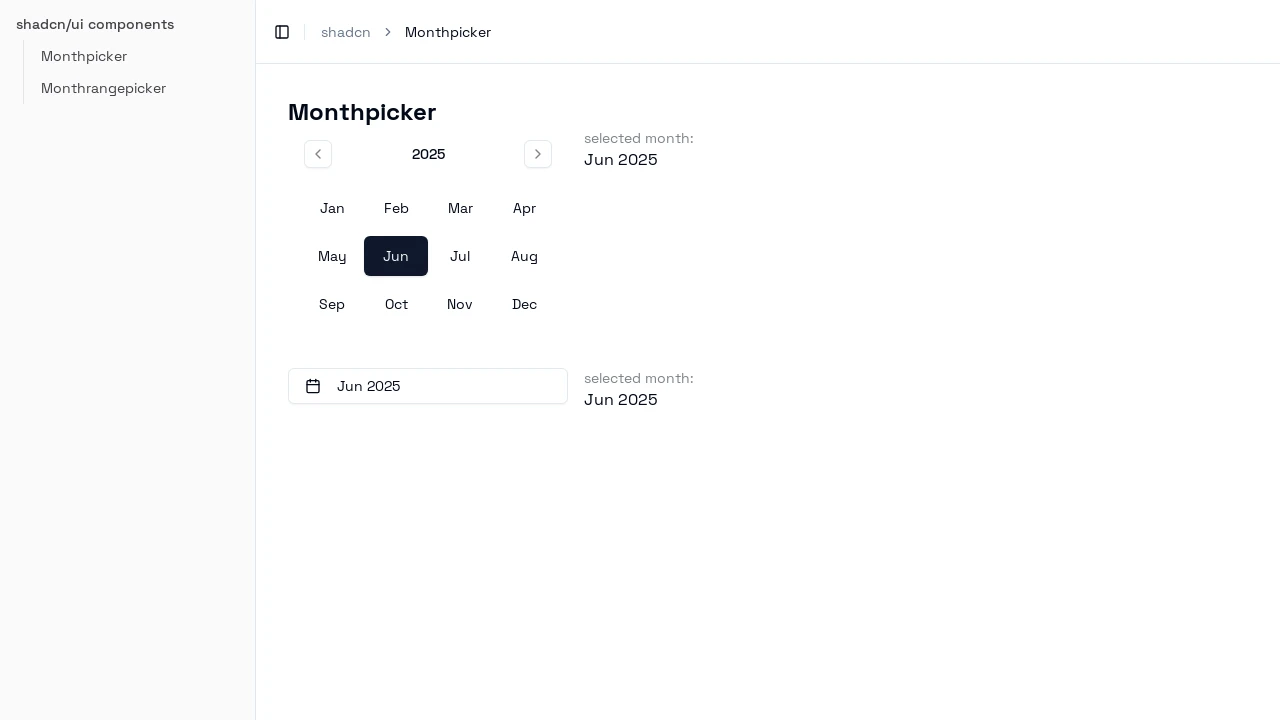
Customizable Month & Month Range Pickers for Shadcn UI
This project provides developers with highly customizable Monthpicker and Monthrangepicker components, specifically designed to integrate seamlessly with the shadcn/ui ecosystem. Built upon Radix UI and Tailwind CSS, these components offer a robust and stylable solution for selecting single months or month ranges. They are ideal for applications requiring precise date period inputs, such as reporting tools or booking systems, enhancing user experience with intuitive controls.
Features:
MonthpickerComponent: Enables users to select a single month, with props likeselectedMonthandonMonthSelectfor state management and event handling.MonthrangepickerComponent: Facilitates the selection of a start and end month, providing props such asselectedMonthRange,onMonthRangeSelect, andonStartMonthSelect.- Shadcn/ui Native: Designed as an extension for shadcn/ui, utilizing its existing components like Button and Popover for a consistent developer experience.
- Flexible Installation: Offers both CLI installation for quick setup (
npx shadcn@latest add) and manual installation by copying component files. - Popover Integration: Optimized for use within shadcn/ui
Popovercomponents to create dropdown month selection interfaces. - Date Constraints: Allows fine-grained control over selectable dates through
minDate,maxDate, anddisabledDates(Monthpicker only) properties. - Navigation Event Callbacks: Includes
onYearForwardandonYearBackwardprops to trigger custom functions when the user navigates between years. - Customizable Labels: The
callbacksprop (withyearLabelandmonthLabelfunctions) enables custom formatting and styling of year and month display text. - Button Styling Variants: The
variantprop allows developers to apply different shadcn/ui button styles (e.g., 'outline', 'ghost') to calendar month buttons and navigation chevrons. - Quick Selectors for Ranges: The
Monthrangepickersupports aquickSelectorsprop to define preset month ranges with custom labels and actions for user convenience. - Form Compatibility: Seamlessly integrates with the shadcn/ui
Formcomponent and supports schema validation using libraries like Zod. - Lucide React Icons: Utilizes icons from Lucide React for visual elements such as the calendar icon and navigation arrows, ensuring clarity and consistency.
Summary:
These Monthpicker and Monthrangepicker components extend shadcn/ui by providing specialized date selection functionalities. Developers can easily integrate them to allow users to pick single months or month ranges, with extensive customization options for appearance, behavior, and date restrictions. They are well-suited for applications needing refined control over month-based date inputs, built with modern web technologies like React, Radix UI, and Tailwind CSS for a rich user experience.

Similar to Shadcn UI Monthpicker:
 SERP BLOCKS
