

gjs-select
gjs-select is a copy-paste Select and combobox for React and shadcn/ui with single, multiple and tags modes, built-in search and virtualized option lists.
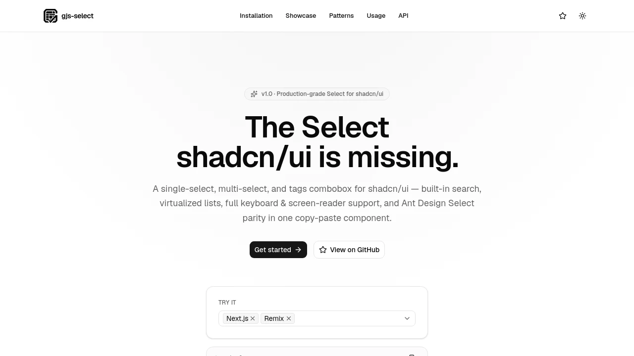
gjs-select: A Full-Featured Select for shadcn/ui
gjs-select is a single Select component for React and shadcn/ui that adds features the default shadcn Select does not offer. It supports single, multiple and tags modes, built-in search with custom filtering and sorting, option groups and virtualized lists for large option sets. Its API follows Ant Design's Select, with props such as maxCount, maxTagCount and labelInValue. The component is built on the Radix Popover primitive, styled with your existing shadcn/ui tokens and installed from its own registry with the shadcn CLI, so the source file lives in your project. It works with React 18.2 and later.
Features:
- Three Modes: Single, multiple and tags modes, with tokenSeparators for free-typed tags.
- Built-in Search: showSearch with custom filterOption, filterSort and optionFilterProp.
- Virtualized Lists: Large option sets stay responsive through @tanstack/react-virtual.
- Ant Design-Style API: Supports maxCount, responsive maxTagCount, fieldNames, option groups and custom renderers.
- Accessibility: Keyboard navigation, listbox and option roles, and managed focus.
- Theming: Outlined, filled and borderless variants, three sizes, status states and RTL support.
- Form Integration: Demo patterns show use with react-hook-form and Zod.
Distribution:
opensource
GitHub:
2 Stars
1 Forks
Categories:

Similar to gjs-select:
 SERP BLOCKS

