
drop-drawer
DropDrawer is a shadcn/ui component providing a responsive dropdown for desktops and a native-feeling drawer for mobile, enhancing user experience.
DropDrawer: Responsive Dropdown & Drawer for shadcn/ui
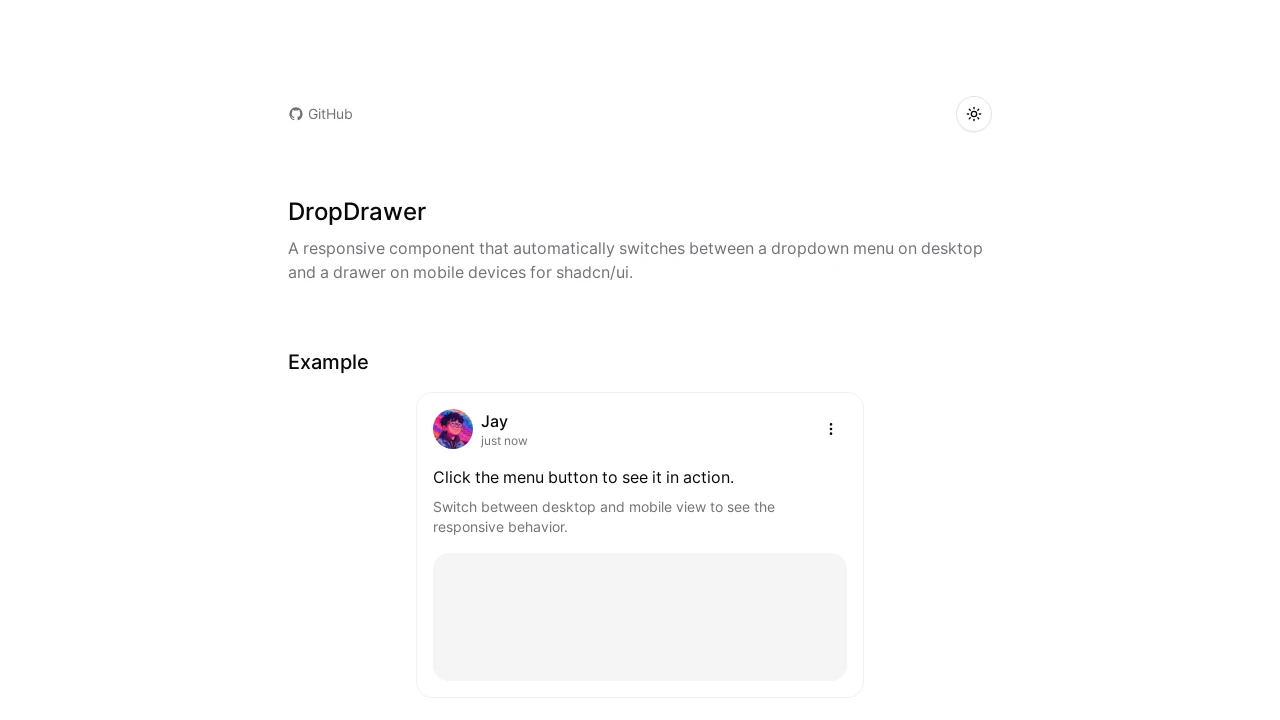
DropDrawer is a React component designed for shadcn/ui, offering an intelligent solution for navigation menus. It automatically displays a traditional dropdown menu on desktop screens and seamlessly transitions to an intuitive, touch-friendly drawer on mobile devices. This ensures a consistent user experience and addresses the common usability challenges of dropdowns on smaller screens, providing a more native feel for mobile users without sacrificing desktop functionality. It's a drop-in replacement for the standard DropdownMenu.
Features:
- Adaptive Interface: Dynamically presents as a standard dropdown on larger screens and converts to a slide-out drawer on smaller mobile screens.
- shadcn/ui Integration: Functions as a direct substitute for the existing
DropdownMenucomponent within the shadcn/ui ecosystem. - Adjustable Breakpoint Logic: Employs a modifiable screen width (defaulting to 768px) to determine the switch between dropdown and drawer views.
- Mobile-First Experience: Delivers a drawer on mobile that mimics native application menus for improved ease of use.
- Familiar API Structure: Maintains an API closely aligned with shadcn/ui's
DropdownMenuto simplify adoption. - Simplified Installation: Offers straightforward setup through the shadcn registry or via manual component integration.
- Programmatic State Control: Enables developers to manage the visibility of the menu using React state properties (
open,onOpenChange). - Hierarchical Menu Support: Facilitates the creation of multi-level navigation structures using
DropDrawerSubelements. - Enhanced Item Styling:
DropDrawerItemallows for inclusion of icons, visual variants (e.g., destructive), and disabled states. - Logical Menu Structuring: Includes
DropDrawerGroupfor semantic item grouping andDropDrawerSeparatorfor visual item separation. - Mobile Drawer Footer: Provides a distinct
DropDrawerFootercomponent for content placement at the base of the mobile drawer. - Theme Versatility: Functions effectively with both light and dark visual themes.
Summary:
DropDrawer enhances web applications built with shadcn/ui by providing a responsive menu component. It intelligently switches between a desktop-friendly dropdown and a mobile-optimized drawer, ensuring optimal user experience across devices. With features like easy migration, nested submenus, and state control, DropDrawer simplifies the implementation of adaptive navigation patterns, making menus more accessible and intuitive, especially on smaller screens, while retaining the familiar shadcn/ui development workflow.

Similar to drop-drawer:
 SERP BLOCKS
