datetime-picker
A Storybook-showcased Shadcn datetime picker with timezone support, min/max date limits, and easy month/year navigation for modern UIs.
Enhanced Datetime Selection: Shadcn Picker with Timezone & Date Controls
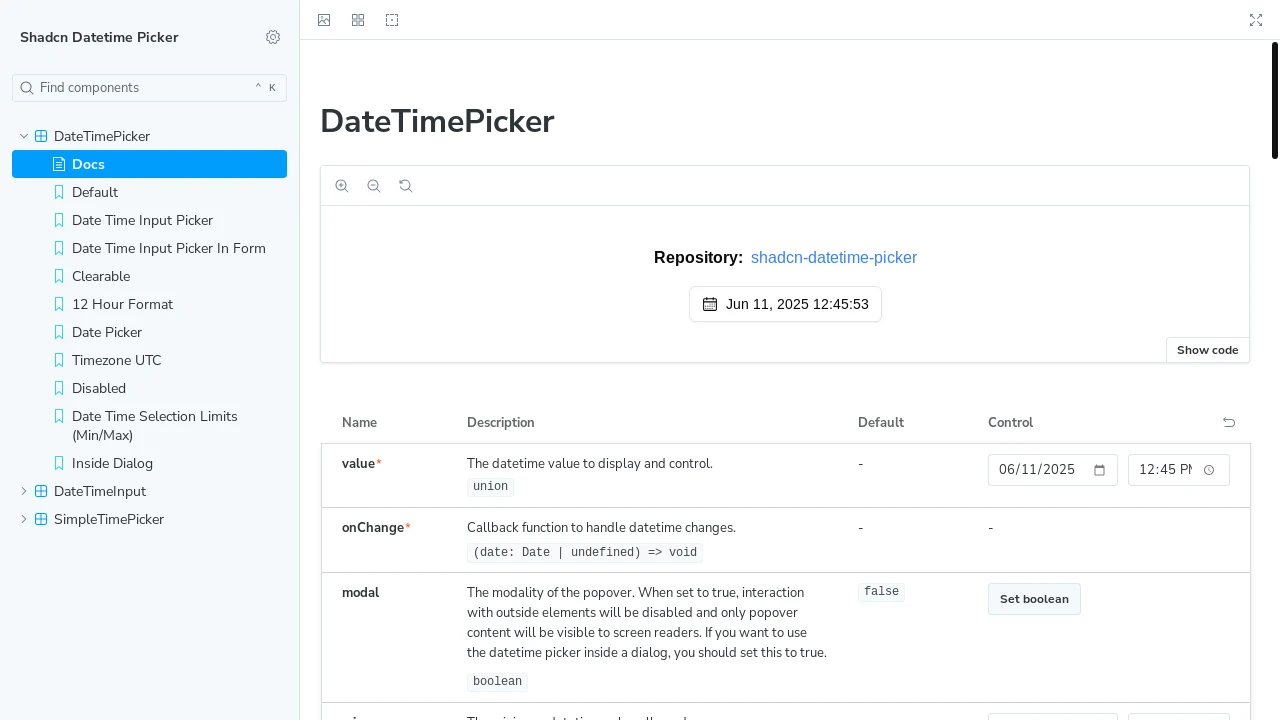
Discover a versatile datetime picker component, showcased within Storybook and designed for seamless integration with Shadcn UI. This tool empowers developers to implement sophisticated date and time inputs, featuring robust timezone support, configurable minimum and maximum date boundaries, and intuitive month and year selection. It's perfect for applications demanding precise temporal data entry, offering a clean and user-friendly interface for a superior development experience.
Features:
- Timezone Support: Enables users to select and display dates and times according to different timezones.
- Min/Max Dates: Allows developers to define acceptable date ranges by setting minimum and maximum selectable dates.
- Month/Year Selection: Offers a user-friendly interface for quickly navigating to and selecting specific months and years.
- Shadcn Component: Designed as a component compatible with the Shadcn UI ecosystem.
- Storybook Integration: Showcased and testable within a Storybook environment for component visualization and development.
Summary:
This Shadcn datetime picker, highlighted in Storybook, provides developers with a powerful solution for capturing date and time information. Key capabilities include timezone management, the ability to restrict selections with minimum and maximum dates, and straightforward month/year navigation. It's an essential component for building forms and applications that require accurate and user-friendly temporal inputs, aligning with modern UI practices.

Similar to datetime-picker:
 SERP BLOCKS
