date-time-range-picker-shadcn
A comprehensive suite of React components for selecting dates, times, and ranges, featuring presets, customization, and accessibility.
Flexible Date and Time Selection Components for React Applications
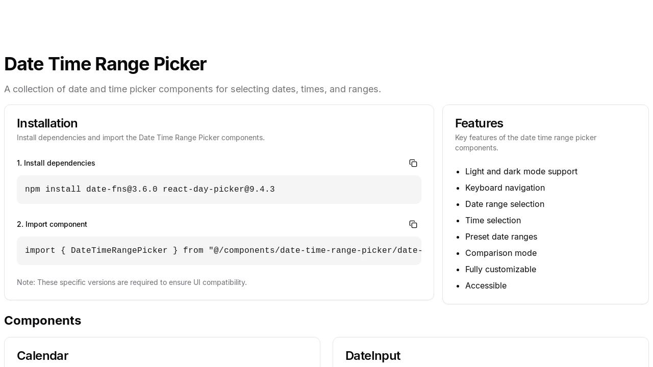
This collection provides developers with a robust set of date and time picker components designed for React applications. It facilitates the selection of individual dates, specific times, and comprehensive date ranges. Built with modularity in mind, these components, including dependencies like date-fns and react-day-picker, offer granular control and easy integration into various projects, simplifying complex date and time input requirements while ensuring UI compatibility.
Features:
- Light and Dark Mode Support: Adapts to different UI themes for visual consistency.
- Keyboard Navigation: Enables full control using the keyboard for enhanced accessibility.
- Date Range Selection: Allows users to intuitively pick a start and end date.
- Time Selection: Facilitates choosing specific hours, minutes, and AM/PM.
- Preset Date Ranges: Offers predefined common date ranges for quick selection.
- Comparison Mode: Enables comparing two different date ranges side-by-side.
- Fully Customizable: Provides extensive options to tailor appearance and behavior.
- Accessible Design: Built with accessibility standards for inclusive user experiences.
- Modular Calendar Component: A standalone calendar for selecting individual dates.
- Modular DateInput Component: Input field with separate segments for day, month, and year.
- Modular TimeInput Component: Input field for hours, minutes, and AM/PM selection.
- Modular DateTimeInput Component: Combines date and time input into a single component.
- Modular DateRangePicker Component: Specialized for selecting date ranges, optionally with presets.
- Modular DateTimeRangePicker Component: Comprehensive component for selecting ranges of both dates and times.
Summary:
This tool offers a collection of versatile date and time picker components for React developers. It supports various selection modes including single dates, times, date ranges, and date-time ranges. Key features include light/dark mode, keyboard accessibility, preset ranges, comparison mode, and high customizability. Built with shadcn/ui, it provides a modern and user-friendly solution for integrating sophisticated date and time selection functionalities into web applications.

Similar to date-time-range-picker-shadcn:
 SERP BLOCKS
