Shadcn Number Input
A customizable number input component for Shadcn UI, built with react-number-format, offering steppers, min/max values, and prefix/suffix support.
Enhanced Number Input Component for Shadcn UI
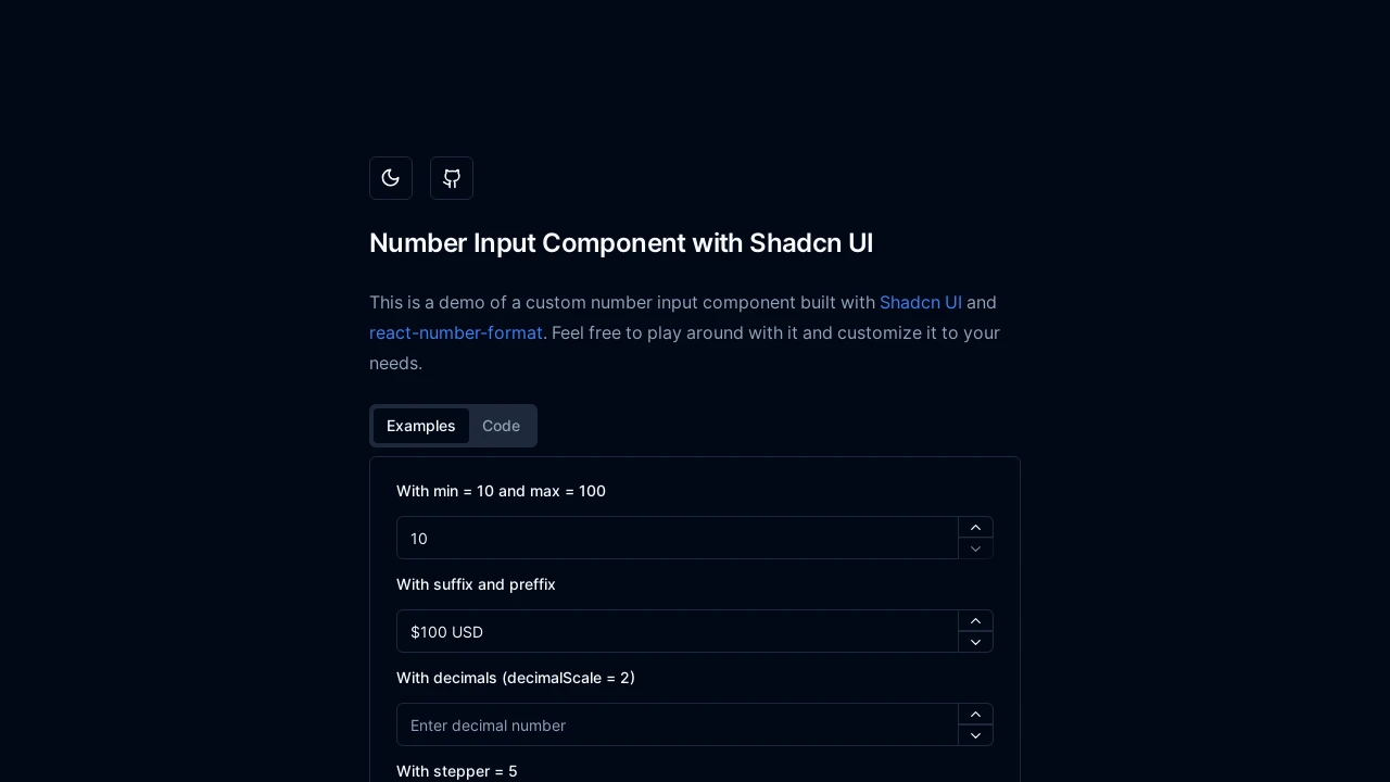
This Shadcn Number Input component leverages react-number-format to deliver a highly customizable and user-friendly experience for numeric data entry within React applications. It seamlessly integrates with Shadcn UI, providing developers with robust control over input behavior, including steppers for incremental changes, defined minimum and maximum values, configurable decimal precision, and the ability to add prefixes or suffixes. It supports both controlled and uncontrolled states for flexible integration.
Features:
- Stepper Controls: Increment/decrement values using dedicated buttons and ArrowUp/ArrowDown keyboard navigation.
- Min/Max Value Limits: Enforce numeric input boundaries, with on-blur clamping for out-of-range values.
- Thousand Separator: Format numbers with a specified character for thousands grouping, enhancing readability.
- Decimal Scale: Define the precise number of decimal places allowed for the input value.
- Fixed Decimal Scale: Maintain a fixed number of decimal places, automatically padding with zeros if necessary.
- Prefix & Suffix: Add custom text or symbols before (prefix) or after (suffix) the numeric input field.
- Default Value: Set an initial value for the component when it first renders.
- Controlled Mode: Supports controlled component behavior via
valueandonValueChangeprops for state management. - Value Change Callback: Provides an
onValueChangeprop that executes a function when the numeric value is modified. - Shadcn UI Styling: Seamlessly integrates with Shadcn UI's
InputandButtoncomponents for a consistent look and feel. - Negative Number Support: Allows negative values automatically if the
minproperty is set to less than zero. - Placeholder Text: Display guiding text within the input field when it is empty.
Summary:
The Shadcn Number Input is a React component designed to enhance numeric input fields within applications using Shadcn UI. It integrates react-number-format to provide extensive formatting options, steppers for easy value adjustment, and validation features like min/max limits. This component simplifies the creation of user-friendly and robust number inputs, supporting both controlled and uncontrolled usage patterns for flexible development needs.

Similar to Shadcn Number Input:
 SERP BLOCKS
