
Components
An open-source collection of type-safe Next.js/React components styled with Tailwind, shadcn/ui, and brijr/craft for fast website building.
Accelerate Web Development with brijr/components: Next.js & Tailwind UI Collection
brijr/components provides developers with an extensive library of open-source React components, meticulously crafted for Next.js applications. These components are styled using Tailwind CSS and are written in TypeScript, ensuring type safety and easy customization. By integrating with popular tools like shadcn/ui and brijr/craft, this collection helps in rapidly building visually appealing and responsive websites, significantly reducing development time and effort for common UI patterns and sections.
Features:
- Next.js Focused Components: A collection of UI elements specifically built and optimized for Next.js applications.
- React Implementation: All components are developed using React, enabling modern, declarative UI construction.
- Tailwind CSS Styling: Components are styled with Tailwind CSS, offering utility-first classes for deep customization and responsiveness.
- TypeScript Type Safety: Written in TypeScript, providing strong typing for improved developer experience and fewer runtime errors.
- shadcn/ui Integration: Designed to work harmoniously with shadcn/ui, allowing developers to leverage both libraries.
- brijr/craft Compatibility: Complements the brijr/craft design system for cohesive and aesthetically pleasing UIs.
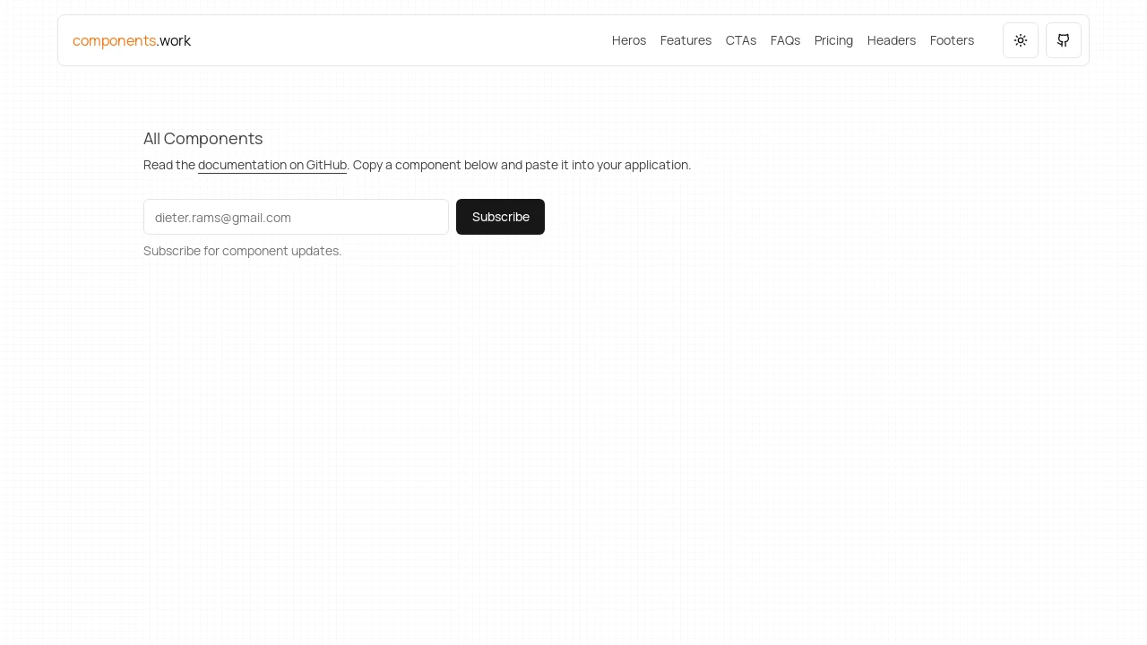
- Copy-Paste Usability: Components are intended to be easily copied from the project website (components.work) and pasted into your application.
- Diverse Component Categories: Includes a variety of pre-built components such as Heros, Call-to-Actions (CTAs), Feature sections, FAQs, Pricing tables, Headers, and Footers.
- Dark Mode Ready: Provides guidance and necessary elements like ThemeProvider and ModeToggle for implementing dark mode functionality.
- Open Source Project: The entire codebase is available on GitHub, encouraging community contributions and transparency.
- Starter Kit Recommendation: Suggests using the brijr/starter project for a pre-configured setup to get started quickly.
- Rapid Development Focus: Aims to significantly speed up the process of building websites and landing pages by providing ready-to-use building blocks.
Summary:
In essence, brijr/components is a toolkit for Next.js developers seeking to expedite their workflow. It offers a variety of pre-designed, type-safe UI components styled with Tailwind CSS, covering common website elements from headers to pricing tables. With its focus on ease of use through copy-paste integration and compatibility with shadcn/ui and brijr/craft, it empowers developers to construct modern web interfaces efficiently, complete with features like dark mode support.

Similar to Components:
 SERP BLOCKS
