autocomplete-select-shadcn-ui
A custom autocomplete component using Shadcn UI and Fancy Multi Select, offering loading/disabled states and customizable features for developers.
Advanced Autocomplete Component for Shadcn UI
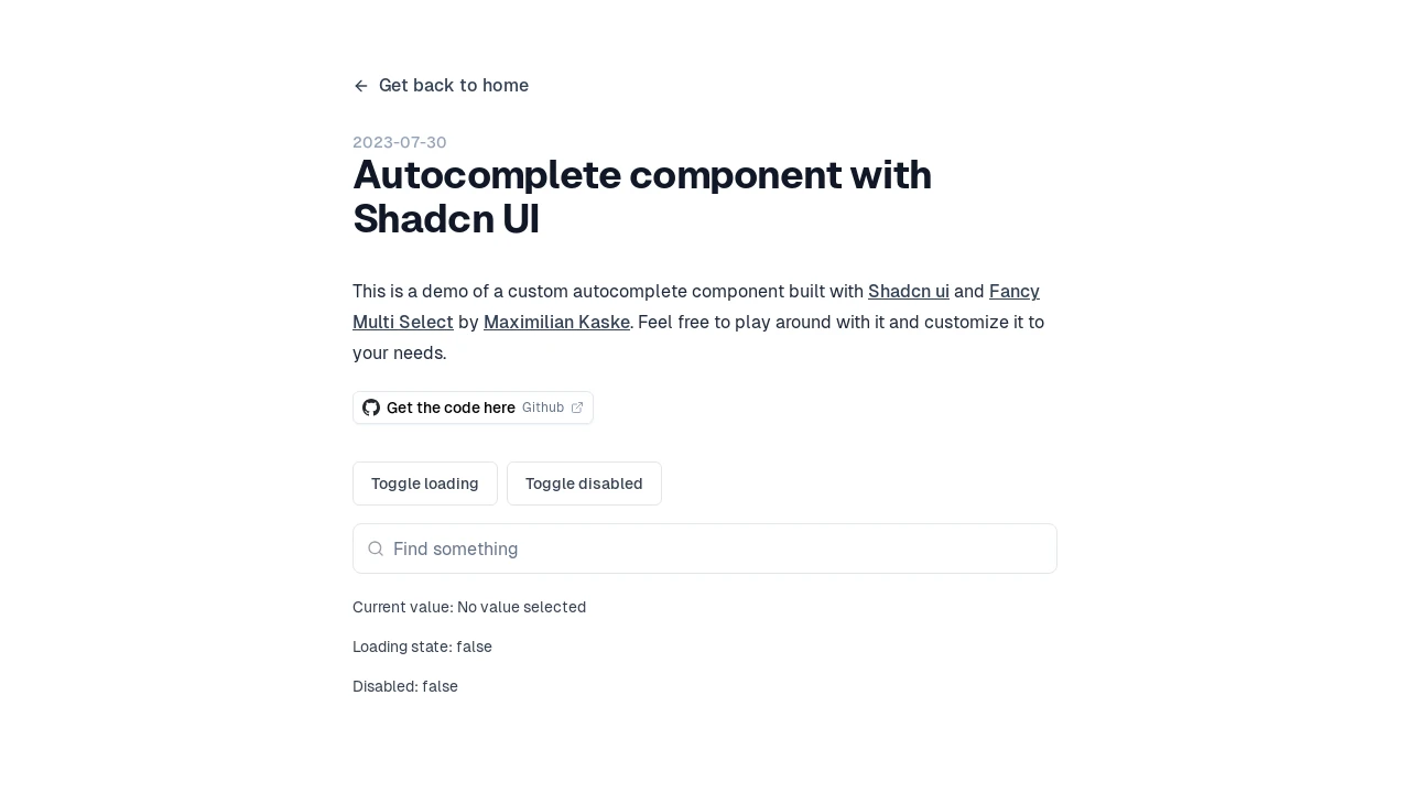
Discover a meticulously crafted autocomplete component, designed to seamlessly integrate the aesthetic appeal of Shadcn UI with the robust functionality of Maximilian Kaske's Fancy Multi Select. This tool empowers developers to implement sophisticated search and selection inputs within their applications. It offers a refined user experience, complete with visual indicators for loading and disabled states, and clear feedback mechanisms such as a 'no results' message, thereby enhancing interaction clarity and usability across various projects.
Features:
- Shadcn UI Integration: Built leveraging the Shadcn UI framework for a modern, consistent, and easily themeable user interface.
- Fancy Multi Select Core: Incorporates Maximilian Kaske's Fancy Multi Select library to provide advanced multi-selection capabilities and a rich user experience.
- Asynchronous Loading State: Features a visual loading indicator, informing users when data is being fetched or processed in the background.
- Interactive Disabled State: Supports a disabled mode, allowing developers to programmatically enable or disable the component based on application logic.
- Clear 'No Results' Feedback: Displays a 'No results' message when the user's input does not match any available options, improving user guidance.
- Current Value Display: Clearly shows the currently selected value(s) or a placeholder if no selection has been made.
- Customizable Behavior: Designed with flexibility in mind, allowing developers to adapt its appearance and functionality to specific project requirements, as suggested by the ability to 'play around with it and customize it'.
Summary:
This autocomplete component provides a developer-centric solution for implementing advanced input controls with a polished look and feel. By combining Shadcn UI's design principles with the versatile Fancy Multi Select, it delivers a customizable, feature-rich experience that includes essential states like loading and disabled, alongside clear user feedback. It's an ideal asset for modern web applications that require intuitive and efficient data selection mechanisms, simplifying the development of complex user interface patterns.

Similar to autocomplete-select-shadcn-ui:
 SERP BLOCKS
