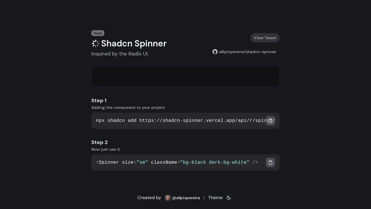
Shadcn Spinner
A lightweight and customizable loading spinner component, designed for easy integration into Shadcn UI projects, now with CLI support.
Shadcn Spinner: Lightweight & Customizable Loading for Shadcn UI
Shadcn Spinner is a focused, lightweight loading spinner component crafted for seamless integration with projects built using the Shadcn UI framework. Inspired by the well-regarded Radix UI, this component offers developers a simple yet customizable way to indicate loading states within their applications. Its design prioritizes ease of use and flexibility, making it a valuable addition to any Shadcn-based development workflow, now even simpler to add via the Shadcn CLI.
Features:
- Lightweight Design: Ensures minimal performance overhead for your application.
- Customizable Appearance: Tailor the spinner's size and style using props like 'size' and 'className'.
- Shadcn UI Focused: Specifically built for straightforward integration into Shadcn UI based projects.
- Shadcn CLI Integration: Add the spinner to your project quickly using the 'npx shadcn add' command.
- Radix UI Inspired: Leverages design principles from Radix UI for a familiar and robust component.
- Dark Mode Support: Easily adapt to dark and light themes via className styling, as demonstrated in usage examples.
Summary:
Shadcn Spinner provides developers with a simple, lightweight, and customizable solution for adding loading indicators to applications built with Shadcn UI. It's inspired by Radix UI and can be quickly integrated using the Shadcn CLI. This component enhances user experience by clearly communicating loading states, offering flexibility in appearance through size and class name props, making it a practical tool for modern web development projects.

Similar to Shadcn Spinner:
 SERP BLOCKS
