
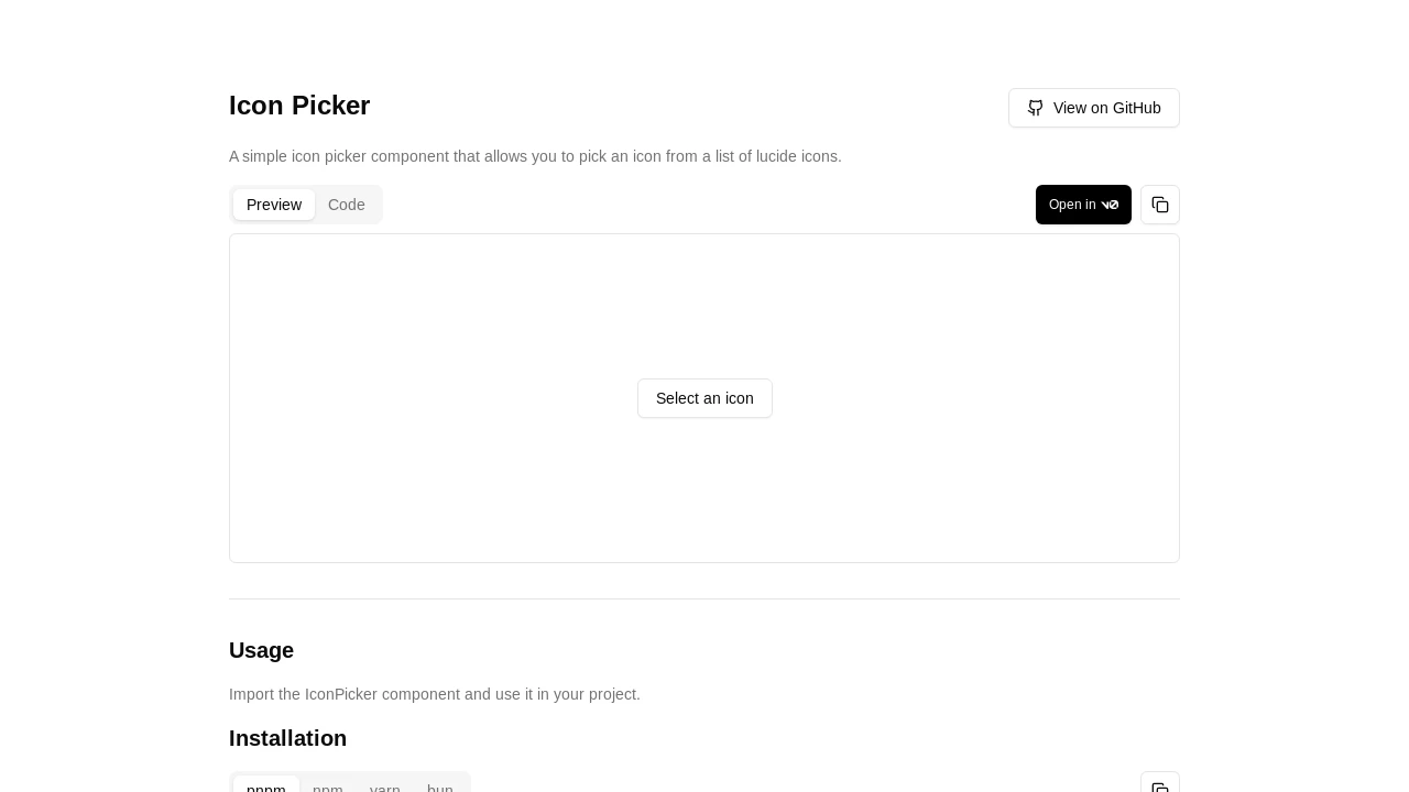
Shadcn Iconpicker
A React component for easily selecting Lucide icons, featuring search, progressive loading, and extensive customization for shadcn/ui projects.
Shadcn Icon Picker: Seamless Lucide Icon Integration for React
Shadcn Icon Picker is a modern React component crafted for developers utilizing shadcn/ui and Lucide Icons. It offers a user-friendly interface for searching and selecting icons, enhancing your application's visual appeal. With features like real-time search and progressive loading, it ensures a smooth user experience. This component simplifies incorporating a vast icon library into your projects, providing high customizability to match your design requirements and improve developer workflow efficiently.
Features:
- Real-time Icon Search: Instantly find icons from the Lucide library as you type.
- Progressive Icon Loading: Efficiently loads icons on scroll, ensuring smooth performance even with large icon sets.
- Full Lucide Icons Support: Provides access to the entire collection of Lucide icons for comprehensive selection.
- Dark Mode Compatible: Adapts seamlessly to both light and dark application themes, maintaining visual consistency.
- Highly Customizable Trigger: Allows using custom React components or elements as the trigger button for opening the picker.
- Controlled & Uncontrolled Modes: Supports both controlled (value/onValueChange) and uncontrolled (defaultValue) component states for flexible integration.
- Categorized Icon Display: Optionally groups icons by categories and includes buttons for quick navigation to desired sections.
- Customizable Placeholders: Set custom text for the search input field and the default trigger button when no icon is selected.
- Modern & Responsive UI: Built with shadcn/ui, offering a sleek, contemporary, and adaptable user interface across devices.
- Custom Icon Lists: Option to provide a specific list or subset of icons instead of the full Lucide set, tailoring to specific needs.
- Modal Rendering Support: Designed to function correctly and maintain layout when rendered inside modal dialogs.
- Open State Management: Programmatically control the picker's visibility using
open,defaultOpen, andonOpenChangeprops.
Summary:
Shadcn Icon Picker delivers a streamlined solution for integrating Lucide icons into React applications, especially those built with shadcn/ui. It boasts real-time search, progressive loading for performance, and extensive customization options like custom triggers and icon categorization. This component simplifies the icon selection process, enriches user interface design, and boosts developer productivity by offering a flexible and efficient method to manage and display a comprehensive icon library within web projects.

Similar to Shadcn Iconpicker:
 SERP BLOCKS
