
Neel UI
Neel UI offers shadcn-inspired, interactive, and customizable UI components for SvelteKit, blending primitive interactivity with design system styling for easy development.
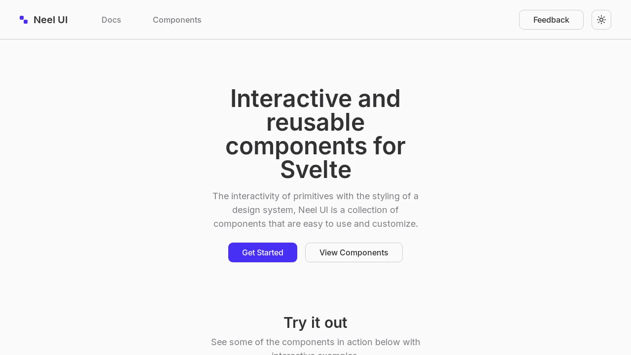
Neel UI: Interactive and Customizable SvelteKit Components
Neel UI is a collection of UI components designed for SvelteKit developers, drawing inspiration from shadcn. It focuses on providing the interactivity of primitive elements combined with the polished styling of a comprehensive design system. These components are built to be both easy to integrate and highly customizable, allowing developers to quickly build modern and responsive user interfaces. The library aims to simplify the development process by offering ready-to-use building blocks for Svelte applications.
Features:
- Button: Interactive button component for user actions.
- Alert Dialog: Modal for critical alerts and user confirmations.
- Dropdown Menu: Versatile menus for navigation or action lists.
- Notifications: Component for displaying brief, informative messages to users.
- Popover: Floating panel for displaying contextual information or controls.
- Switch: Toggle control for binary state selection.
- Select: Dropdown for choosing one option from a predefined list.
- Combo Box: Input field with type-ahead suggestions and selection capabilities.
- Sheet: Side panel component that slides in, available from left or right orientations.
- Checkbox: Standard input for selecting one or more boolean options.
- Shadcn-Inspired Styling: Modern aesthetics influenced by the shadcn/ui design principles.
- Customizable Components: Designed for easy adaptation to various project themes and specific requirements.
- SvelteKit Integration: Optimized for seamless use within SvelteKit applications.
Summary:
Neel UI provides SvelteKit developers with a suite of shadcn-inspired UI components. It emphasizes ease of use and customization, merging the interactive nature of basic elements with sophisticated design system aesthetics. This collection includes common interface elements like buttons, dialogs, menus, and form inputs, enabling developers to build polished and functional user interfaces efficiently. The library is geared towards simplifying the creation of modern web applications with Svelte.

Similar to Neel UI:
 SERP BLOCKS
