Streamlit Shadcn Dashboard
An interactive sales dashboard built with Streamlit and Shadcn UI, visualizing city-specific annual and monthly sales performance metrics for insightful data analysis.
Dynamic Sales Performance Dashboard with Streamlit & Shadcn UI
This project presents a fully functional sales dashboard created using the Python library Streamlit, with its user interface enhanced by the elegant Shadcn UI components. It's designed to provide clear and actionable insights from sales data, offering breakdowns by city and tracking performance across both annual and monthly periods. This serves as a practical example for developers looking to build interactive data visualization tools with a modern look and feel for business analytics.
Features:
- Streamlit Integration: Leverages Streamlit for rapid development of interactive data applications.
- Shadcn UI Components: Employs the streamlit-shadcn-ui package for a polished and responsive user interface.
- Sales Data Insights: Delivers visualizations and metrics for understanding sales trends.
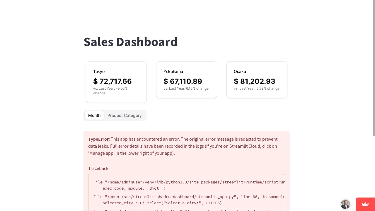
- City-Specific Analysis: Allows for filtering or viewing sales data based on different cities.
- Annual Performance Metrics: Displays key figures related to yearly sales achievements.
- Monthly Performance Metrics: Provides a granular view of sales performance on a month-by-month basis.
- Key Metric Cards: Features prominent display cards for Total Revenue, Subscriptions, Sales, and Active Now (as seen in demo).
- Sales Overview Chart: Includes a line chart for visualizing overall sales trends over a selected period (as seen in demo 'Overview' chart).
- Recent Sales Table: Presents a list of recent sales transactions with customer details and amounts (as seen in demo 'Recent Sales').
- Date Range Selector: Incorporates a date picker for filtering data within specific timeframes (as seen in demo 'Date range picker').
- Tabbed Navigation: Organizes information into sections like 'Overview', 'Analytics', 'Reports', and 'Notifications' for better usability (as seen in demo tabs).
Summary:
This Streamlit-based sales dashboard, enhanced with Shadcn UI, effectively demonstrates how to build an interactive and visually appealing application for sales data analysis. It provides a comprehensive overview of sales performance through various metrics, charts, and tables, segmented by city and time. This project is a valuable resource for developers aiming to create sophisticated data-driven dashboards for business intelligence and reporting purposes.

Similar to Streamlit Shadcn Dashboard:
 SERP BLOCKS