

SmoothUI
SmoothUI is an open-source collection of animated React components, blocks and templates that install through the shadcn CLI and are styled with Tailwind CSS.
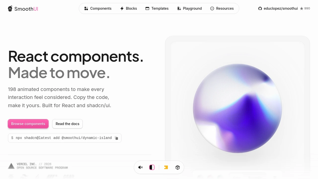
SmoothUI: Animated Components for shadcn/ui Projects
SmoothUI is an open-source collection of React components with animations built on Motion and styled with Tailwind CSS. It is designed for projects that already use shadcn/ui: components install through the shadcn CLI from the @smoothui registry or through a dedicated SmoothUI CLI, and the source lands in your codebase for editing. Beyond single components, the site offers pre-built page sections such as heroes, pricing and FAQs, full starter templates, and a playground for trying components before adding them. The library is MIT licensed and written in TypeScript.
Features:
- Motion Animations: Components ship with built-in animations powered by the Motion library.
- shadcn Registry Install: Components can be added with commands such as npx shadcn@latest add @smoothui/dynamic-island.
- SmoothUI CLI: A dedicated CLI handles installation and resolves component dependencies automatically.
- Blocks and Templates: Pre-built page sections and full starter pages that can be restyled.
- Dark Mode: Components support both light and dark themes.
- Color Customization: A color switcher makes it easy to adjust the theme.
- MCP Support: An MCP integration lets AI assistants discover and add components.
- TypeScript: Components include full type definitions.
Distribution:
opensource
GitHub:
990 Stars
57 Forks
Categories:

Similar to SmoothUI:
 SERP BLOCKS

