shadcn-ui-storybook (JheanAntunes)
JheanAntunes' Storybook setup registers all shadcn/ui components, offering developers an interactive visual catalog for easy exploration and reference.
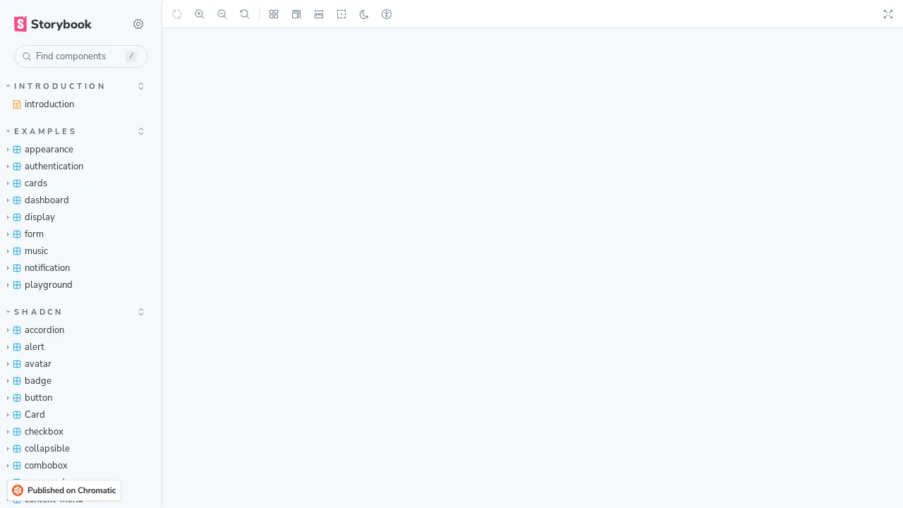
Explore All shadcn/ui Components in JheanAntunes' Storybook
Discover JheanAntunes' dedicated Storybook environment, meticulously configured to showcase the complete suite of shadcn/ui components. This setup provides developers an interactive platform to browse, inspect, and understand each component's functionality and appearance. It serves as an excellent resource for accelerating UI development by offering a clear visual reference and interaction examples for the popular shadcn/ui library, all conveniently organized within Storybook for quick assessment and integration.
Features:
- Complete shadcn/ui Library Showcase: All shadcn/ui components are registered and accessible for review.
- Interactive Component Playground: Powered by Storybook, allowing live interaction with each component.
- Visual Reference for Developers: Enables easy viewing and understanding of the look, feel, and behavior of components.
- Props Exploration: Storybook controls facilitate manipulation of component properties for dynamic testing and visualization.
- Organized Component Navigation: Components are systematically structured within Storybook for intuitive browsing and quick discovery.
Summary:
JheanAntunes' project provides a comprehensive Storybook instance where all shadcn/ui components are meticulously registered and displayed. This offers developers a valuable tool to visually explore, interact with, and understand the full spectrum of shadcn/ui elements. It's an ideal resource for quickly assessing how these popular UI components look and behave, thereby streamlining their integration into web development projects by offering a centralized, interactive component library demonstration.

Similar to shadcn-ui-storybook (JheanAntunes):
 SERP BLOCKS