
shadcn-storybook-registry
A curated collection of Storybook stories for Shadcn/ui components, enabling developers to rapidly document and visualize atomic UI elements.
Shadcn/ui Storybook Registry: Streamlined Component Documentation
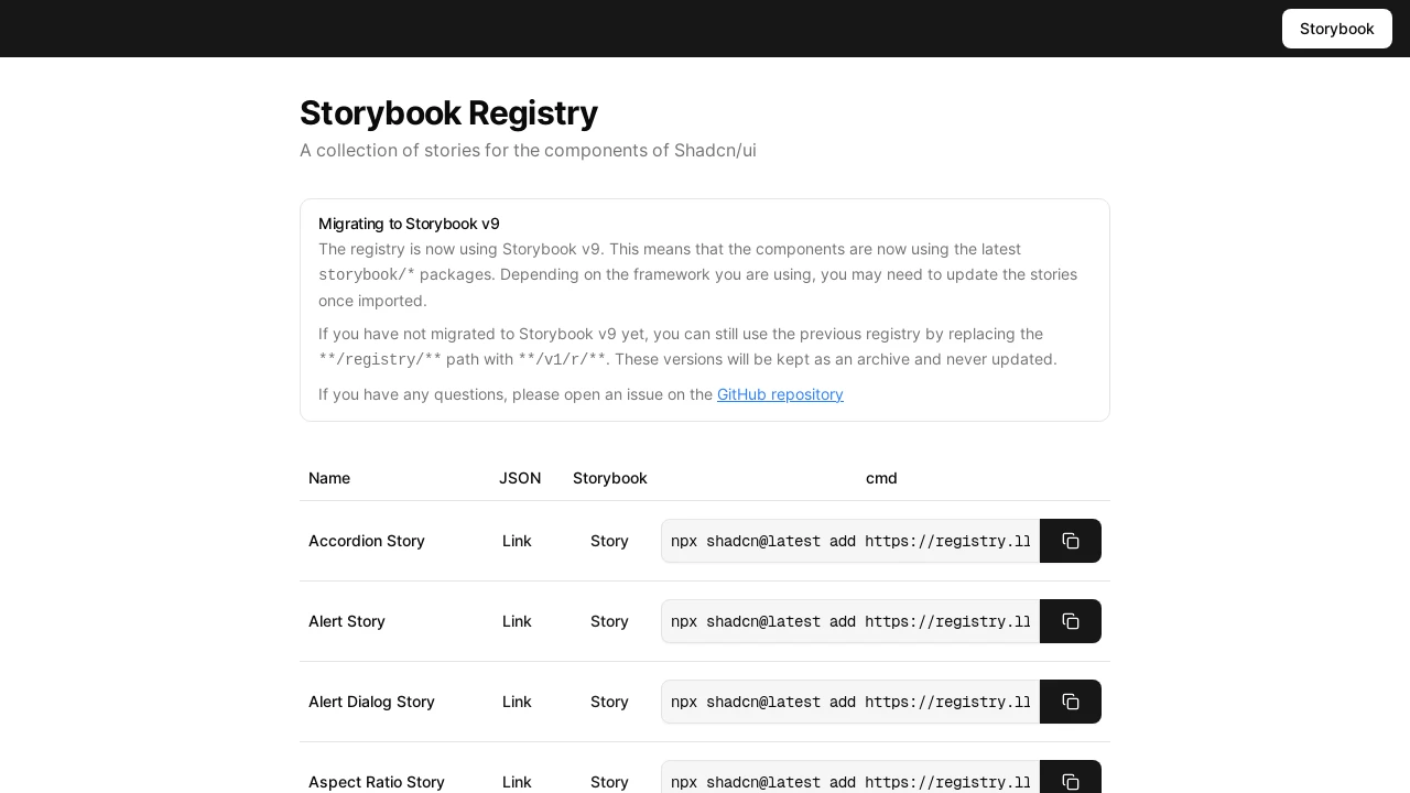
The Shadcn Storybook Registry offers a comprehensive collection of pre-built Storybook stories specifically designed for Shadcn/ui components. This resource helps developers accelerate their documentation process by providing ready-to-use examples for individual UI elements. It facilitates a clearer understanding and visualization of atomic components, promoting consistency and efficiency in UI development workflows. The registry supports Storybook v9, ensuring compatibility with the latest features and practices.
Features:
- Story Collection for Shadcn/ui: Offers a comprehensive collection of Storybook stories for various Shadcn/ui components.
- Storybook v9 Integration: Built using the latest Storybook v9 packages for up-to-date story authoring and compatibility.
- Legacy Version Access: Provides a 'v1/r/' path for accessing an archived registry for projects using older Storybook versions.
- Component Story Links: Includes direct links to view individual component stories within a Storybook environment.
- Copy Command for Stories: Offers a convenient command to easily copy and integrate specific component stories into developer projects.
- JSON Data for Registry Items: Lists components with associated JSON links, suggesting structured data access for automation or inspection.
- Extensive Component Coverage: Features stories for a wide array of Shadcn/ui components, including Accordion, Alert, Button, Calendar, Card, Carousel, Chart, Dialog, Form, Input, Menubar, Pagination, Popover, Table, Tabs, Toast, Tooltip, and many others.
Summary:
This registry serves as a dedicated resource for developers using Shadcn/ui, providing a rich library of Storybook stories. It simplifies the process of documenting and testing individual UI components by offering ready-made story configurations. By leveraging this tool, developers can ensure their component library is well-documented and easily explorable, supporting faster development cycles and better collaboration within teams using the Shadcn/ui ecosystem and Storybook for UI development.

Similar to shadcn-storybook-registry:
 SERP BLOCKS