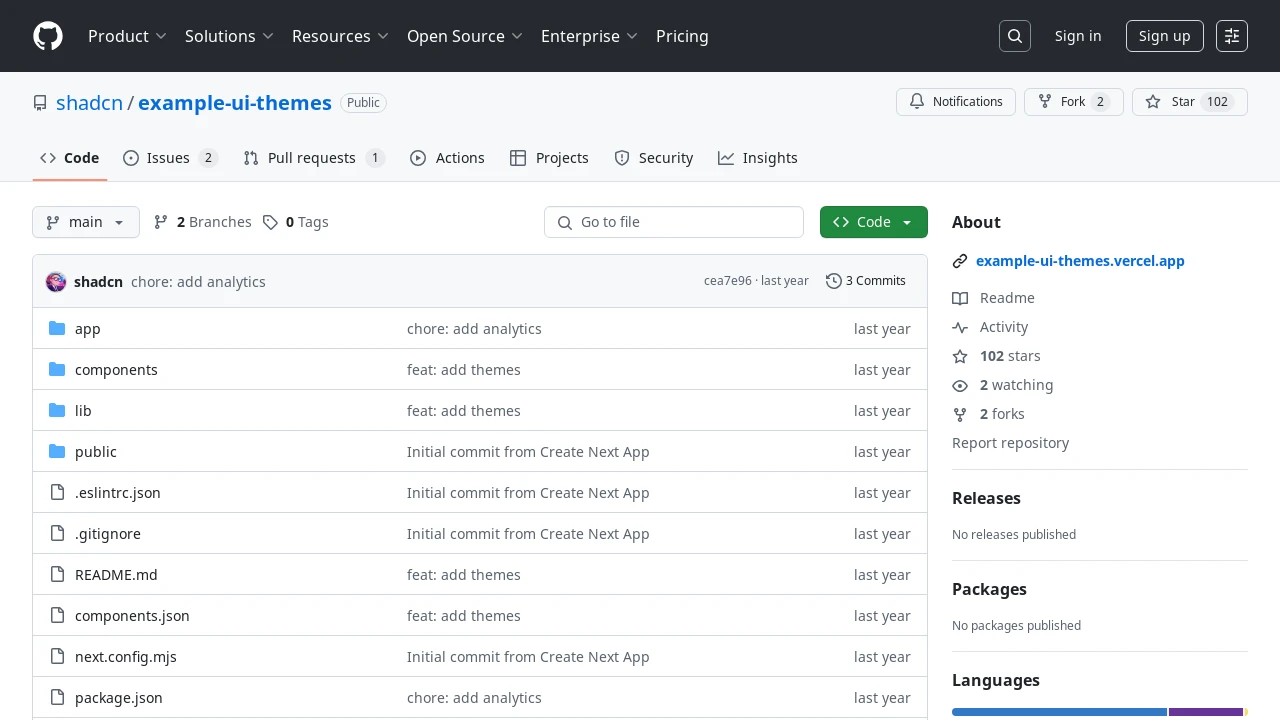
Example UI Themes
A system for defining, applying, and persisting multiple light/dark themes in applications using CSS variables and a shared state management.

Dynamic Theme Management for Modern Web Interfaces
This toolkit provides a structured method for integrating switchable visual themes into web applications. It employs CSS custom variables to define distinct themes, such as 'orange' and 'green', each with specific styles for light and dark modes. User preferences for themes are saved in local storage, ensuring a consistent visual experience across browsing sessions. The system includes core components that facilitate the application of themes and allow users to select their preferred look and feel, simplifying the development of customizable user interfaces.
Features:
CSS Variable-Driven Theming: Theme styles, including background and foreground colors, are defined using CSS custom properties (e.g.,--background,--foreground) for straightforward customization and extension.Integrated Light/Dark Modes: Each theme inherently supports both light and dark variations, which are activated and controlled by specific CSS class combinations (e.g.,.dark .theme-orange).Local Storage Persistence: User-selected themes are durably stored in the browser's local storage, typically viaatomWithStorage, ensuring theme choices persist across sessions.Shared Theme State: A centralized store, as exemplified byuse-theme.ts, manages the current theme's string value, making it globally accessible to components.Dynamic Theme Application: A wrapper component, likeThemeWrapper.tsx, consumes the current theme from the store and applies the corresponding CSS class (e.g.,theme-orange) to its child elements.User Interface for Theme Selection: A dedicated component, such asThemeSelector.tsx, provides interactive elements, commonly buttons, enabling users to switch between available themes by updating the shared store.Support for Multiple Themes: Thethemes.cssfile serves as a central repository for defining several distinct themes, allowing for a variety of visual styles liketheme-orangeandtheme-green.
Summary:
This system offers developers a practical solution for implementing customizable light and dark themes. By leveraging CSS variables for styling, local storage for user preference persistence, and dedicated TypeScript/TSX components for state management and user interaction, it simplifies the creation of personalized visual experiences. The architecture supports multiple pre-defined themes, enhancing the adaptability and user appeal of web applications by allowing easy visual customization.