Shadcn UI Customizer
Extend shadcn/ui with this customizer to visually tweak themes, adjust CSS variables, and generate code for your project.
Shadcn/UI Theme Customization Tool
This open-source tool extends the popular shadcn/ui library, offering developers a powerful way to customize their themes. It provides an intuitive interface with color pickers to visually adjust a wide range of CSS variables, from background and foreground colors to border radius. Users can easily generate and copy the resulting CSS to integrate the customized theme into their projects, ensuring a unique and consistent design.
Features:
- Background Color Customization (--background): Tweak the main background color for your theme.
- Foreground Color Customization (--foreground): Adjust the primary text and icon color.
- Card Styling (--card, --card-foreground): Modify background and text colors for card components.
- Popover Styling (--popover, --popover-foreground): Adjust background and text colors for popover elements.
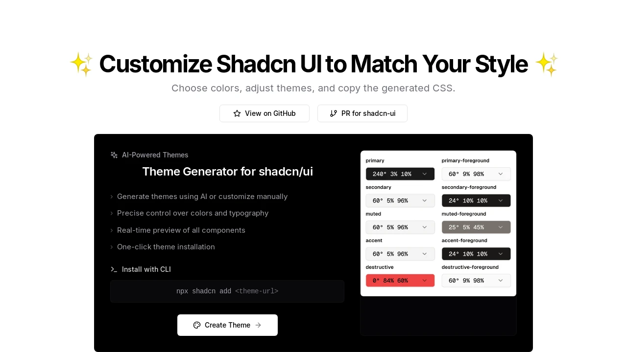
- Primary Accent Colors (--primary, --primary-foreground): Define and customize primary brand colors and their foregrounds.
- Secondary Accent Colors (--secondary, --secondary-foreground): Define and customize secondary brand colors and their foregrounds.
- Muted Element Colors (--muted, --muted-foreground): Set colors for muted text and less prominent elements.
- Interactive Accent Colors (--accent, --accent-foreground): Define accent colors for interactive UI elements and their foregrounds.
- Destructive Action Colors (--destructive, --destructive-foreground): Set specific colors for actions like delete or cancel.
- Border Color Control (--border): Modify the default border color used across components.
- Input Field Styling (--input): Adjust the background or border color of input fields.
- Focus Ring Customization (--ring): Define the color of the focus indicator ring.
- Border Radius Adjustment (--radius): Globally adjust the border radius for components.
- Visual Color Pickers: Intuitively select and fine-tune all theme colors using integrated color pickers.
- CSS Variable Export: Easily copy the generated CSS variables for direct integration into your project.
Summary:
This tool empowers developers to visually customize shadcn/ui themes by providing direct control over essential CSS variables through an intuitive interface with color pickers. It simplifies the process of theme personalization, allowing users to quickly generate and apply unique styles to their shadcn/ui components. The focus is on fine-grained adjustments for backgrounds, text, accents, borders, and radii, making theme adaptation straightforward.

Similar to Shadcn UI Customizer:
 SERP BLOCKS