Shadcn Themes
A visual tool for generating shadcn/ui themes. Pick colors, preview changes, and get CSS variables for your project's light and dark modes.
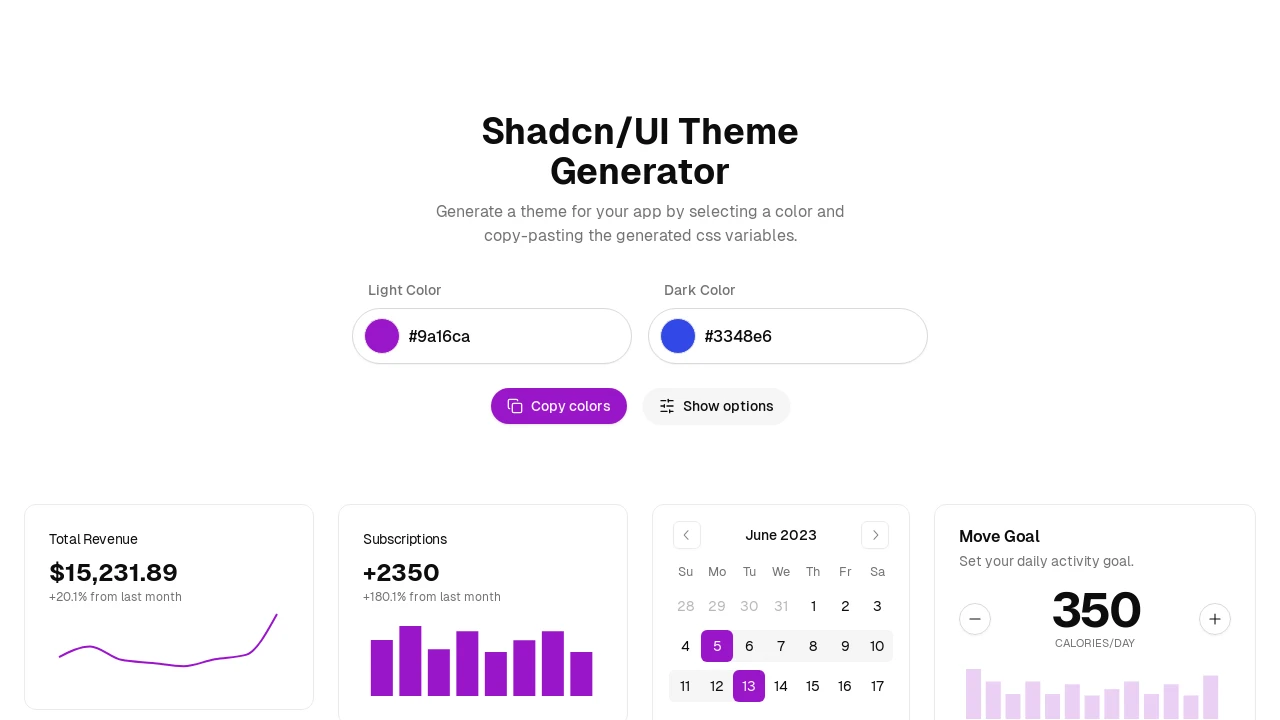
Dynamic Theme Creation for Shadcn/UI Components
This Shadcn/UI Theme Generator empowers developers to visually construct custom themes. By choosing distinct base colors for light and dark interface modes, you can observe the aesthetic changes on various sample UI elements. The tool then produces the essential CSS variables, which can be copied and integrated into your projects, simplifying the theming process and ensuring a consistent visual identity across your application.
Features:
- Light Theme Color Picker: Define your light mode's visual style by selecting a primary color.
- Dark Theme Color Picker: Establish your dark mode's aesthetic by choosing a primary color.
- Automated CSS Variable Output: Produces the necessary CSS custom properties reflecting your color selections for both themes.
- Instant CSS Copy Function: Allows for quick copying of all generated CSS variables for straightforward implementation.
- Interactive Component Showcase: (Inferred from demo) Provides a visual demonstration of how the selected theme applies to common shadcn/ui elements.
- Advanced Options Panel: (Based on 'Show options') Offers access to further customization settings for theme generation.
Summary:
The Shadcn/UI Theme Generator is a utility designed to accelerate the customization of shadcn/ui based applications. It allows developers to intuitively select colors for light and dark themes, see live previews on example components, and directly obtain the CSS variables. This significantly reduces the time spent on manual styling, enabling rapid development of visually cohesive and personalized user interfaces with minimal effort.
Tags:

Similar to Shadcn Themes:
 SERP BLOCKS